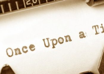
„Erzähl mir eine Geschichte!“ – Diesen Satz hat bestimmt jeder schon einmal gehört oder selbst gesagt. Geschichten bringen Menschen zusammen, am Lagerfeuer, im Kino oder bei einem Treffen mit Freunden die man länger nicht gesehen hat. Geschichtenerzählungen gibt es seit Anbeginn der Zeit. Von Höhlenmalereien zu Theaterstücken zu Büchern und Bewegtbild, Geschichten waren immer faszinierend für die Menschheit.
The origin of the term mural derives from the Latin word murus, meaning »wall« or muralis meaning »of a wall«.1 It defines a painting large at scale, applied to a wall or ceiling – or other equivalent surfaces. The art of mural painting goes way back – it is considered to be the oldest art form performed by humans, leaving its traces all over the world: the Lascaux cave in France can be mentioned as a prominent example. It is believed that already 40,000 years back, the first signs of human creation of this sort started evolving.
‘‘The beautiful is that which produces effects in us that are (relatively) permanently pleasurable in revival. The ugly, on the contrary, is that which produces effects of (relatively) permanent painfulness in revival’’ (Marshall, 1893)
Der Begriff Neuroästhetik wurde erst im 20. Jahrhundert maßgeblich geprägt. Es gibt jedoch Anhaltspunkte dafür, dass sich Wissenschaftler schon seit ca. 250 Jahren mit dem Zusammengang von Neurowissenschaften und ästhetischen Erfahrungen beschäftigen.
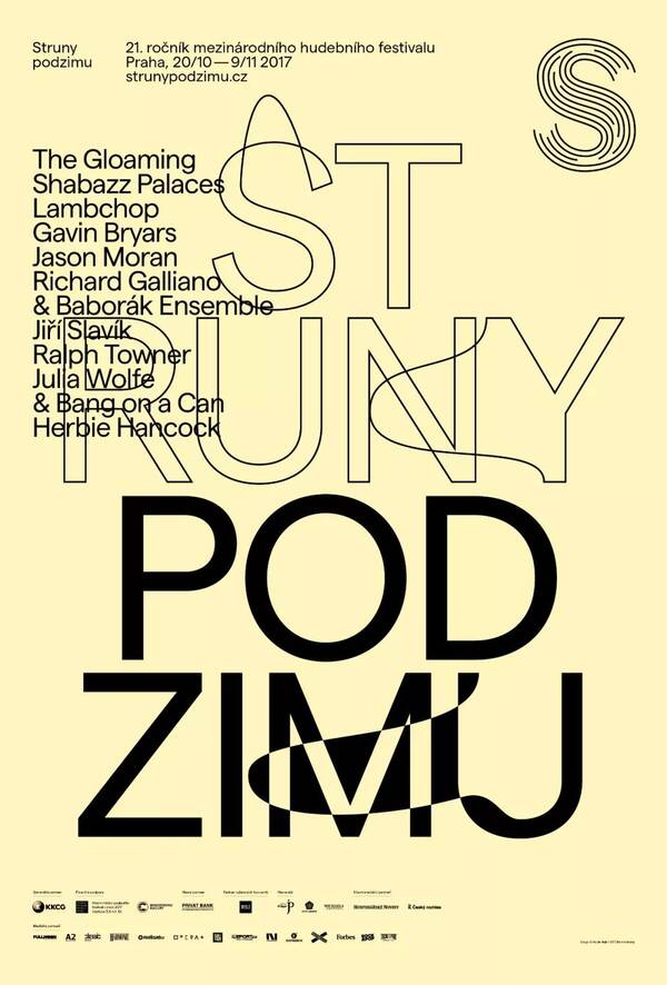
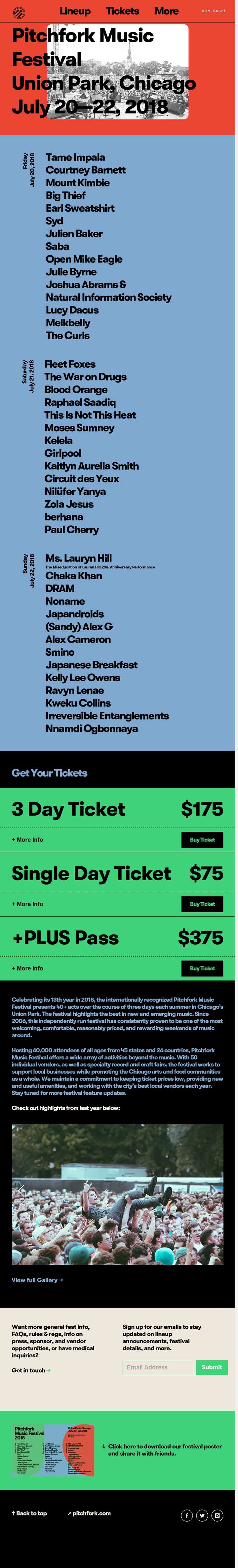
The most beautiful thing in the world is the sight of the sky and the rhythm of the ear. Music always evokes the most enthusiastic echoes in people’s hearts, and the existence of music festivals is different from concerts-they are also expressions of art. The festival seems to be more likely to lead people to the „self“ that should be released-the unrestrained, unyielding, bold, free and easy soul, and a section of rhythm. It is the spirit that seduces every unruly soul that transcends the body to do whatever it takes-to see the chorus of thousands of people at the festival, and everyone will recognize it-that is the charm of music. The festival’s website assets are as fascinating as the festival itself. The designer uses an artistic effect that is almost beyond the „music itself“, feeling the charm of the festival for every visitor who may be there, and its design is excellent almost all over the design world, just like fullmoonfest’s water powder design. Mmf’s hand-painted elements, unlimited release of the passion for music; SXSW,NOSSO is more „realistic“ unrestrained scene is where the designer pen; pitchfork uses the „big character“ design to convey strong feelings. The official website of every music festival is the work of the artist, and here we can see one after another. “ Design emotions „erupt.“
In this week’s blog, I’m classifying music festival brands into different categories so as to research in a more data method: design with science.
1.illustration
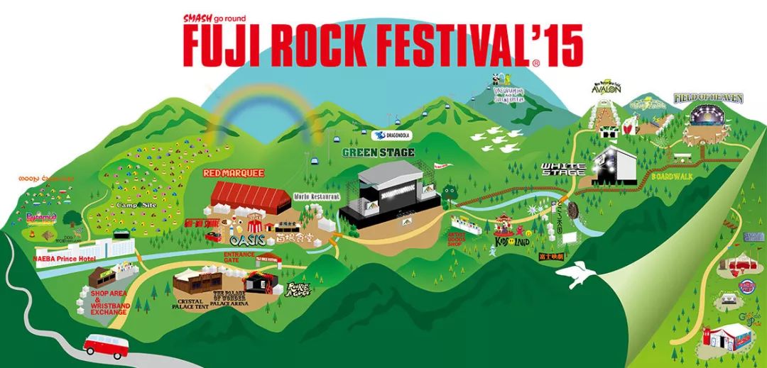
Japan fuji
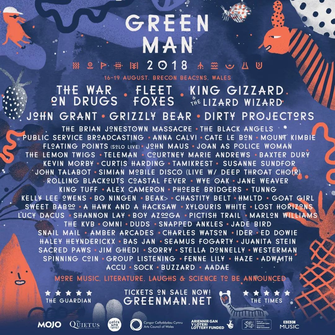
Britan Green Man
Meredith Music Festival 2017
Taipei Azalea Music Festival
2.Vector Graphics
Barcelona
2018 Barcelona Jazz Festival visual image design
Nowadays multilingualism is playing an important role in communication media, as a result of globalisation and the increasing interaction of different cultures around the world. Designers are facing new typographic challenges, when working with not only different languages but also with multiple scripts and language systems, each of them with distinct visual precepts and habits.
Taking the European context as starting point of this research and also, a good example of multilingualism, it is interesting to consider that there are currently 23 officially recognised languages within the European Union, as well as over 60 regional minority languages spoken by approximately 40 million of people. Half of Europeans are able to handle a conversation in at least one additional language, besides their mother tongue, which for most would be English, as the undoubtedly lingua franca of today’s society. Moreover, a quarter of Europeans are able to speak a third language, and a few are fluent even in a forth.
This multilingual scenario is really common in countries like Spain, Belgium or Croatia, in which the coexistence of several official languages, influence not only the daily life of their citizens but also the urban landscape through city signs or printed media.
Comparison of Spanish and Catalan texts.
In the field of design, these language requirements will affect typographic aspects of digital and printed media, when combining two or even three languages. The particularities of each language include the use special glyphs or the variation orthographic rules. This will often mean a different use of form and space while working with text and will need several typographic adjustments. For example, in German based designs, the length of the words is really significant in comparison with English or French. Non-German speakers would have a tough time if they try to use the same type and paragraph parameters they would use in their own languages. A similar phenomenon occurs with Spanish and Catalan words. Although the two languages are really similar and come from Latin roots, Catalan happens to be longer than Spanish, and also includes different glyphs and word structures which will influence the final design.
But to consider multilingualism in Europe, it is really important to have a look on the Balkan countries as a significant example of language coexistence. Within Croatia, Bosnia and Montenegro, there are up to four official languages which are used simultaneously in public communications. Nevertheless, while Bosnian, Croatian and Montenegrin are written in Latin script, Serbian (which is featured as one of the official languages in these countries) is traditionally written in Cyrillic script. Indeed, Cyrillic is broadly used in Europe far from the Russian borders and is not only owned by the Russian language. The confusion is understandable considering that Russia includes the biggest number of Cyrillic users, but this script is actually used to write over 50 languages, including Serbian and Ukrainian.
Three scripts were historically used in the former Yugoslavia: Cyrillic, Latin and Glagolitic, also agents of cultural, religious and political identities. The parallel development and coexistence of the Yugoslavian languages resulted in shared features which make western Balkan languages really similar to each other, although written in different scripts.
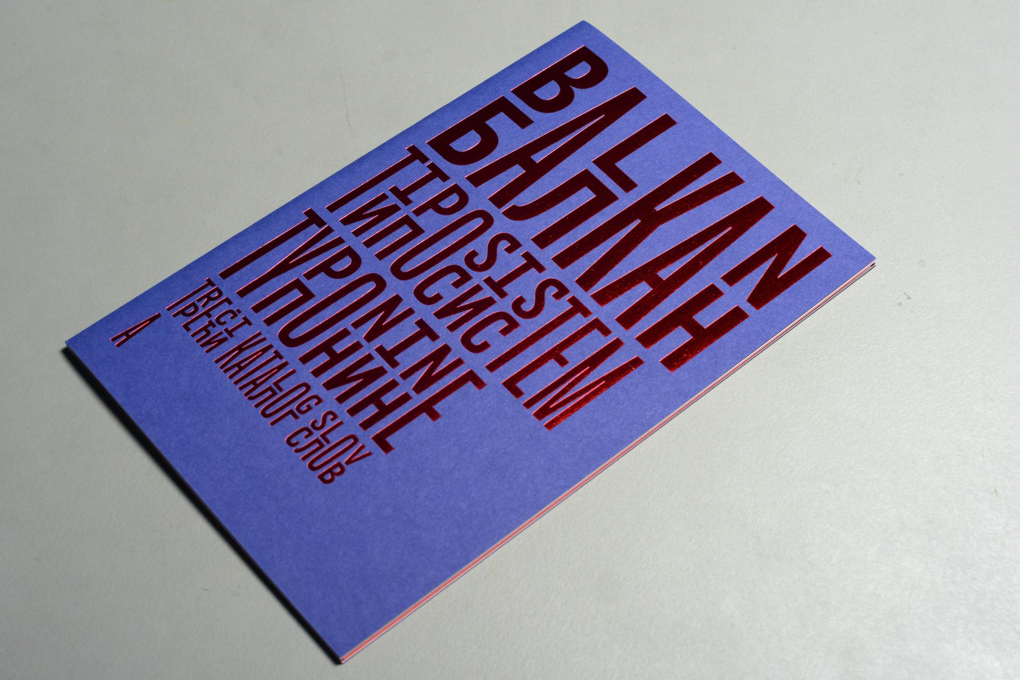
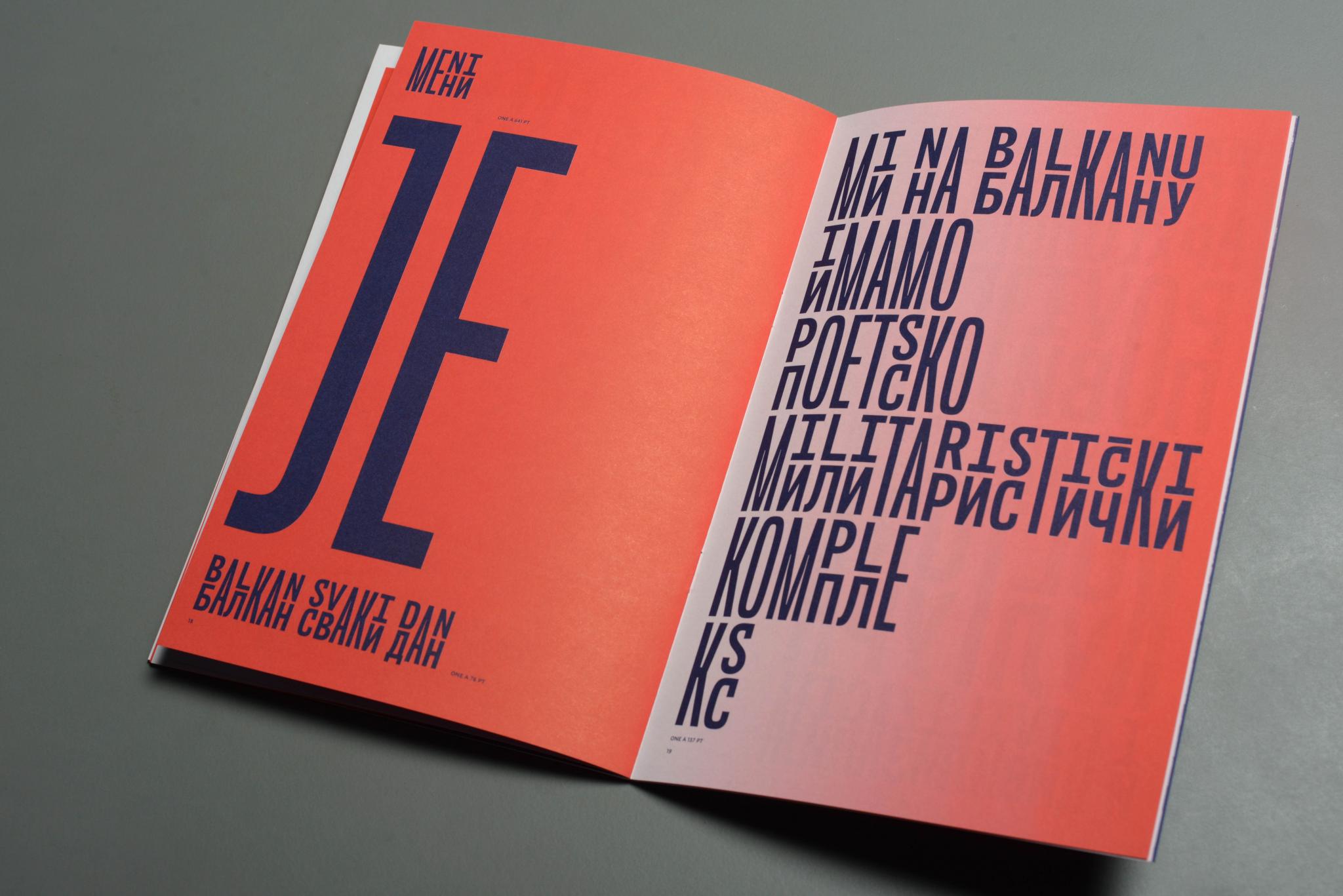
The concurrence of this languages across countries often leads to political misunderstandings at a time of separation and division. With a multilingual background, the designers Marija Juza and Nikola Djurek developed in 2012 Balkan, a bi-scriptural typeface meant to create unity and reconciliation in favour of education, tolerance and communication. The typeface is designed to combine both Latin and Cyrillic scripts for the transliteration of Croatian and Serbian, inspired in a phenomenon known as “The Balkan Sprachbund”, based on the linguistic features shared between different languages because of proximity. It uses single, shared glyphs to represent the sounds of both languages and allow users who don’t know Cyrillic to read texts in both scripts at the same time. Undoubtedly, a good tool for learning about different scripts and bring languages together.
Balkan Type Specimen by Nikola Djurek and Marija Juza
The combination of different scripts would be a struggle for those designers who were Latin based. Although several characters may seem familiar, they include its own orthographic rules and variations, which should be considered before starting to work with typography and layout. Cyrillic looks really beautiful and appealing, especially considering its geometric and regular shape, really different from Latin ascendant and descendant letters. Considering the vast number of languages in Europe, it may be a good moment for designers to explore their orthographic and script requirements as a challenge for their typographic knowledge.
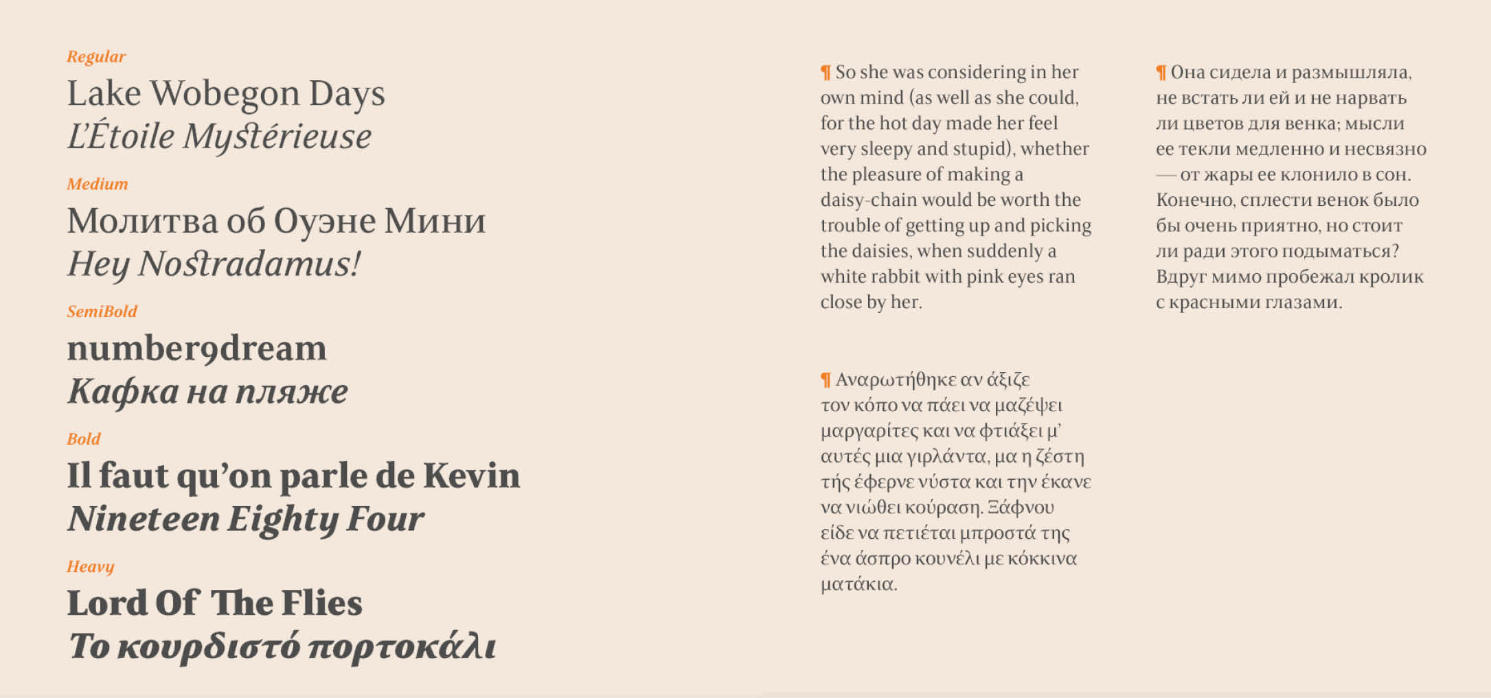
FS Sally Pro Specimens in Latin, Cyrillic and Greek
„Understand how people think is crucial if you’re going to design for them.“ (Weinschenk Susan)
Um Emotionen und ihren Zusammenhang mit Design verstehen zu können, muss man sich zunächst mit den drei verschiedenen Aspekten unseres emotionalen Systems auseinandersetzen. Don Norman unterscheidet in seinem Buch, „Emotional Design: Why we love (or hate) everyday things“, zwischen drei verschiedenen Formen: visceral (instinktiv), behavioral (verhaltensbezogen) und reflective (reflektierend).
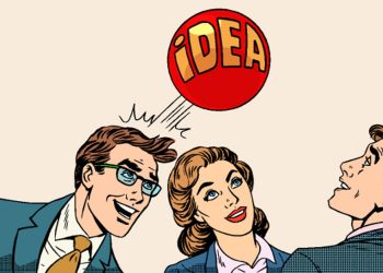
Wenn Unternehmen nach etwas Neuem und Kreativen gefragt werden, neigen die Mitarbeiterinnen und Mitarbeiter meist dazu, das bereits Erreichte zu optimieren. Es bleibt wenig Zeit über neue Ideen oder Lösungen nachzudenken. Der derzeitige Fokus auf Effizienz ist der Gegensatz zur Kultivierung einer kreativen Umgebung. Doch um innerhalb der Komplexität des 21. Jahrhunderts relevant bleiben zu können, müssen wir kreativ sein. Um diesen kreativen Arbeitsplatz zu entwickeln, müssen wir umdenken – quasi einen Schritt verlangsamen um schneller zu werden.
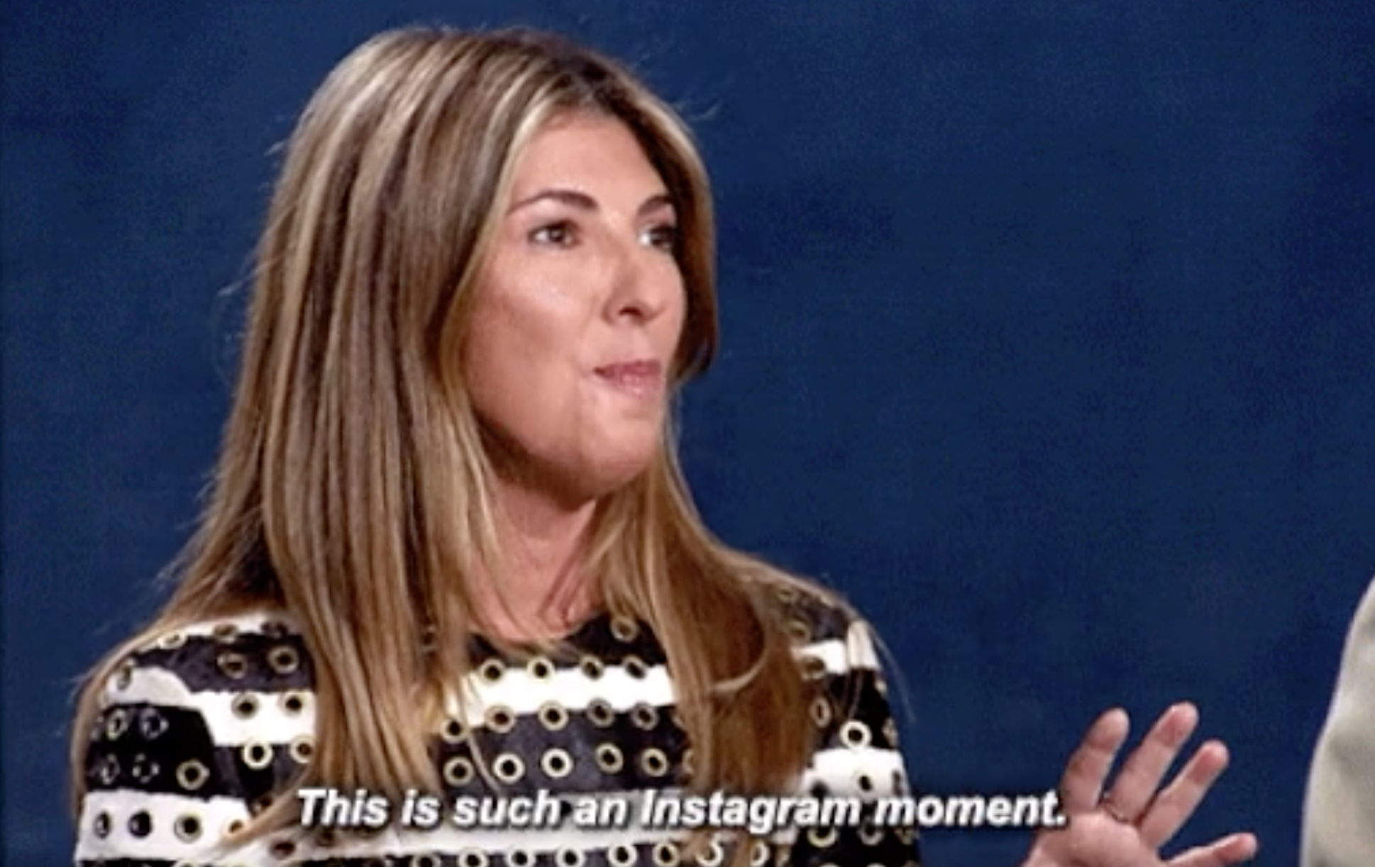
Instagram wird als Social Media-Plattform jährlich größer und bedeutender und hat Facebook als wichtigstes Netzwerk unter jungen Leuten längst abgelöst, obwohl Instagram 2012 von Facebook aufgekauft wurde. Von einer einfachen Image-Plattform mit klaren Einschränkungen (1:1-Seitenverhältnis für Fotos, statische Filter) wurde die App um zahlreiche z.T. trendweisende Features erweitert (Stories, Insta-TV, animierte Filter) und wird aktuell von etwa einer Milliarde Usern regelmäßig genutzt.
Was treibt Menschen dazu an Bilder und Geschichten in sozialen Netzwerken mit Freunden und zum Großteil uneingeschränkt mit fremden Personen zu teilen? Entspricht die digitale Darstellung des Selbst dem „echten“ Selbst, welches im Alltag zum Ausdruck kommt?
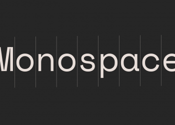
Früher waren sie eine technische Notwendigkeit, heute sind sie bewusste gestalterische Entscheidungen: Monospaced Typefaces.
In meiner Recherche zum Thema Monospaced Typefaces will ich insbesondere darauf eingehen, was den unverwechselbaren Charme nicht proportionaler Schriften ausmacht und warum sie noch heute gerne verwendet werden.
Monospaced Schriften sind nicht schön, ihr technisches Aussehen ist primär einem praktischen Grund verschuldet. Dennoch werden sie finden sie noch häufig Verwendung – auch im Kontext Design. Doch warum sind wir bis Heute so fasziniert von den blockhaften Zeichen?