
Nowadays multilingualism is playing an important role in communication media, as a result of globalisation and the increasing interaction of different cultures around the world. Designers are facing new typographic challenges, when working with not only different languages but also with multiple scripts and language systems, each of them with distinct visual precepts and habits.
Taking the European context as starting point of this research and also, a good example of multilingualism, it is interesting to consider that there are currently 23 officially recognised languages within the European Union, as well as over 60 regional minority languages spoken by approximately 40 million of people. Half of Europeans are able to handle a conversation in at least one additional language, besides their mother tongue, which for most would be English, as the undoubtedly lingua franca of today’s society. Moreover, a quarter of Europeans are able to speak a third language, and a few are fluent even in a forth.
This multilingual scenario is really common in countries like Spain, Belgium or Croatia, in which the coexistence of several official languages, influence not only the daily life of their citizens but also the urban landscape through city signs or printed media.
In the field of design, these language requirements will affect typographic aspects of digital and printed media, when combining two or even three languages. The particularities of each language include the use special glyphs or the variation orthographic rules. This will often mean a different use of form and space while working with text and will need several typographic adjustments. For example, in German based designs, the length of the words is really significant in comparison with English or French. Non-German speakers would have a tough time if they try to use the same type and paragraph parameters they would use in their own languages. A similar phenomenon occurs with Spanish and Catalan words. Although the two languages are really similar and come from Latin roots, Catalan happens to be longer than Spanish, and also includes different glyphs and word structures which will influence the final design.
But to consider multilingualism in Europe, it is really important to have a look on the Balkan countries as a significant example of language coexistence. Within Croatia, Bosnia and Montenegro, there are up to four official languages which are used simultaneously in public communications. Nevertheless, while Bosnian, Croatian and Montenegrin are written in Latin script, Serbian (which is featured as one of the official languages in these countries) is traditionally written in Cyrillic script. Indeed, Cyrillic is broadly used in Europe far from the Russian borders and is not only owned by the Russian language. The confusion is understandable considering that Russia includes the biggest number of Cyrillic users, but this script is actually used to write over 50 languages, including Serbian and Ukrainian.
Three scripts were historically used in the former Yugoslavia: Cyrillic, Latin and Glagolitic, also agents of cultural, religious and political identities. The parallel development and coexistence of the Yugoslavian languages resulted in shared features which make western Balkan languages really similar to each other, although written in different scripts.
The concurrence of this languages across countries often leads to political misunderstandings at a time of separation and division. With a multilingual background, the designers Marija Juza and Nikola Djurek developed in 2012 Balkan, a bi-scriptural typeface meant to create unity and reconciliation in favour of education, tolerance and communication. The typeface is designed to combine both Latin and Cyrillic scripts for the transliteration of Croatian and Serbian, inspired in a phenomenon known as “The Balkan Sprachbund”, based on the linguistic features shared between different languages because of proximity. It uses single, shared glyphs to represent the sounds of both languages and allow users who don’t know Cyrillic to read texts in both scripts at the same time. Undoubtedly, a good tool for learning about different scripts and bring languages together.
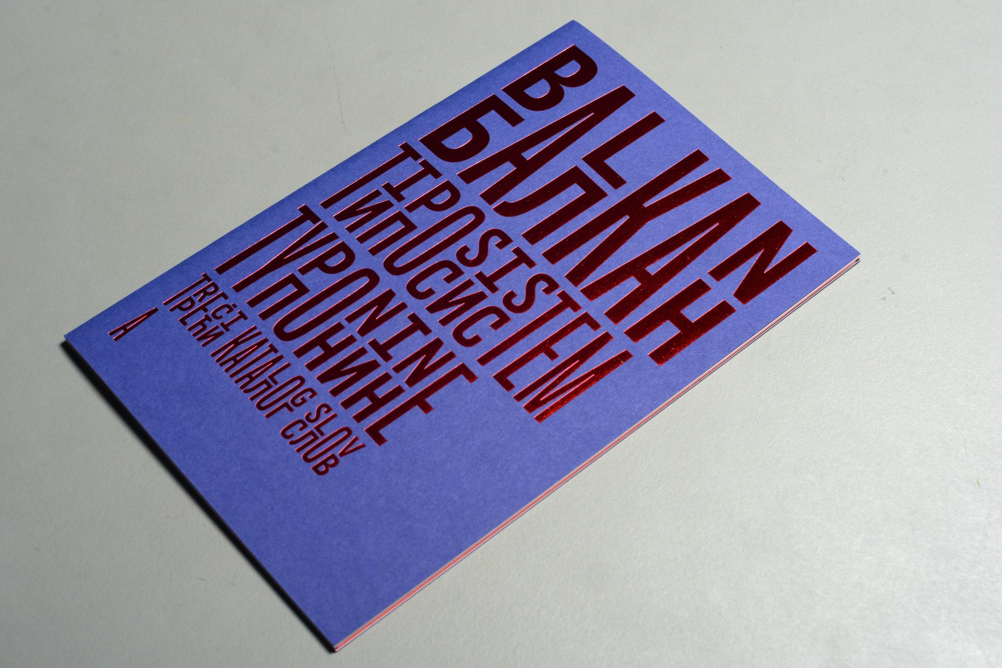
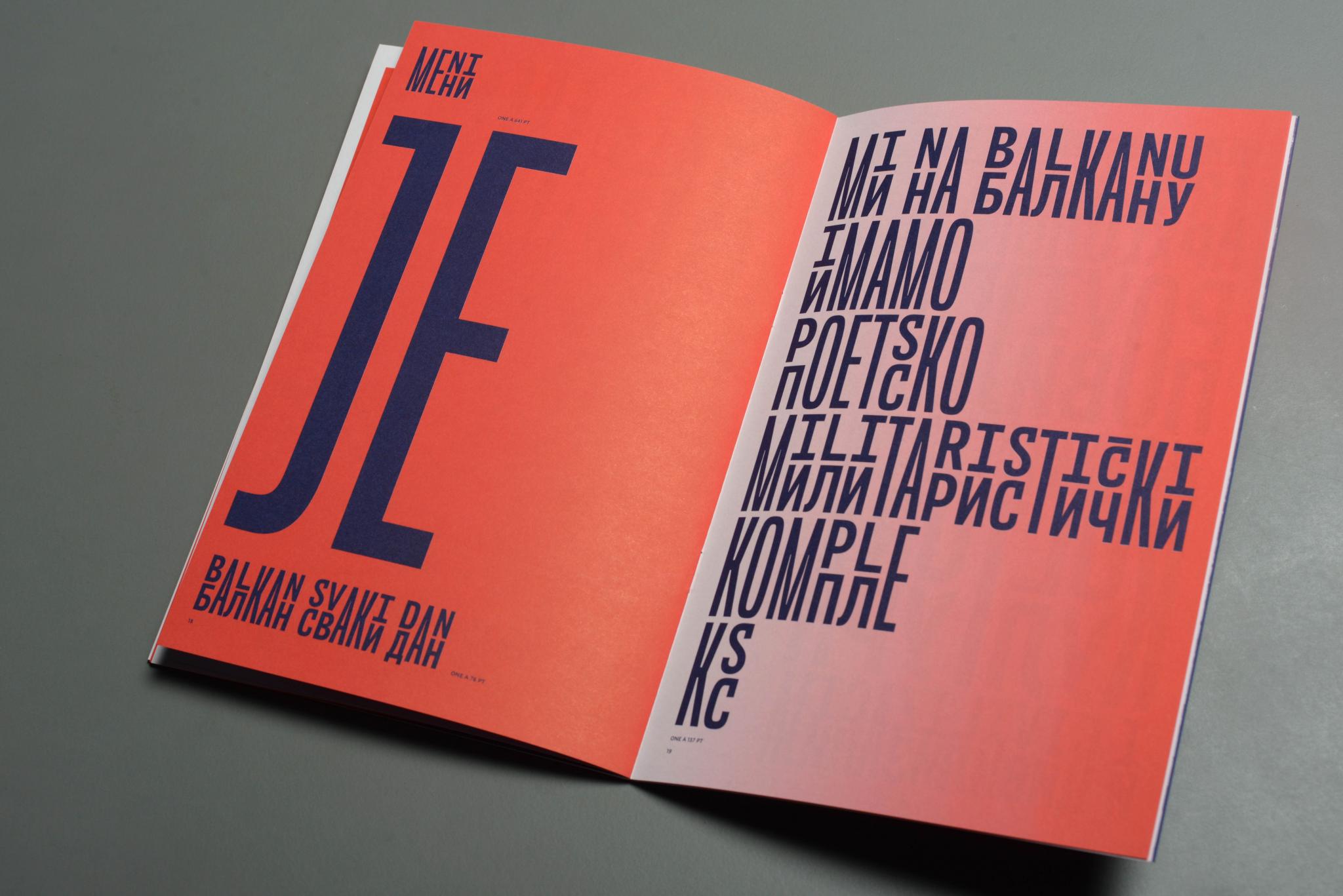
Balkan Type Specimen by Nikola Djurek and Marija Juza
The combination of different scripts would be a struggle for those designers who were Latin based. Although several characters may seem familiar, they include its own orthographic rules and variations, which should be considered before starting to work with typography and layout. Cyrillic looks really beautiful and appealing, especially considering its geometric and regular shape, really different from Latin ascendant and descendant letters. Considering the vast number of languages in Europe, it may be a good moment for designers to explore their orthographic and script requirements as a challenge for their typographic knowledge.
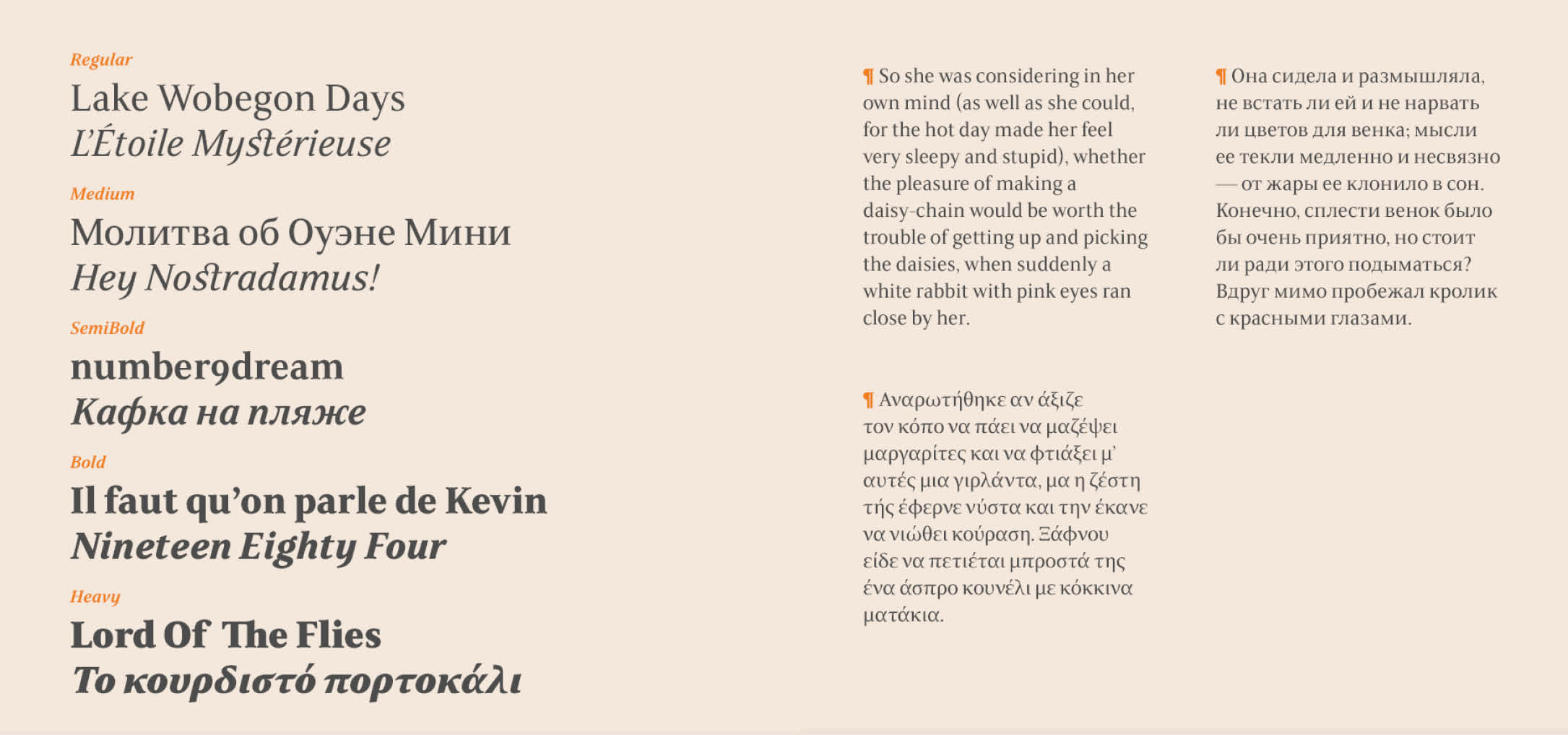
FS Sally Pro Specimens in Latin, Cyrillic and Greek
Bibliography:
https://www.typotheque.com/fonts/balkan_sans/about
https://europa.eu/european-union/topics/multilingualism_en
https://www.theguardian.com/news/datablog/2014/sep/26/europeans-multiple-languages-uk-ireland
Image:
- Tata & Friends, Plazida https://tatafriends.com/Plazida
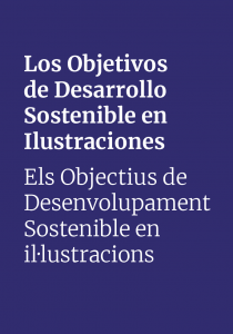
- Fundación Mainel, ODS, Miradas desde la ilustración. Irene Martínez & Salva Antón. ( Personal Work)
- Balkan type specimen https://www.typotheque.com/books/balkan_type_specimen
- FS Sally Pro https://www.fontsmith.com/blog/2016/09/21/fontsmith-respond-to-increase-in-demand-for-global-language-support-with-fs-sally-pro