Master Thesis Review

Peralta, Elena. (2016) La actualidad de la tipografía multiescritura. Màster Universitari de Tipografia Avançada, EINA, Centre Universitari de Disseny i Art de Barcelona (UAB) Barcelona.

Peralta, Elena. (2016) Relevance of multi-script typography. Master of Advanced Typography EINA, Centre Universitari de Disseny i Art de Barcelona (UAB) Barcelona. 


Design Level

This Master Thesis focuses on design theory, being the research itself the main objective of the project. It has a high level of design not only because of its topic but also because of its methodology and presentation. 


Innovation

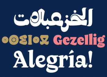
The aim project is the consideration of the present status of multi-script typography, a new field from typography design which intends to create tools for the use and representation of different languages on today’s written communication. 

Although it is not highly innovative -because it is as a consideration of a pre-existing design topic- the Thesis’ specificity makes it quite distinctive. It is also interesting to point out that his kind of typographic practice stills pretty young, being first used on the late 90’s. Therefore, there are not many research projects focused on this topic.


Self-sufficiency     

The Thesis talks by itself. It includes an exhaustive research, based on the knowledge of other experts of its area, combined with its own voice. It could be even published as a book by itself.


Outline and structure

It has well defined objectives and methodology. At first it presents the context and basics of this kind of typographic practice and also clarifies common misunderstandings related to the topic.

Afterwards it defines the connection between language, writing and multilingual communication with the use of typography. 

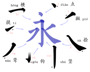
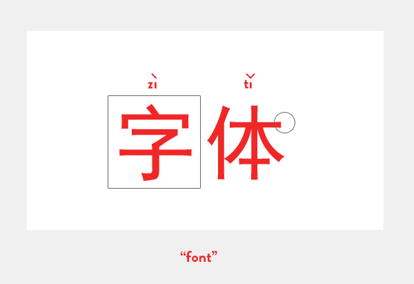
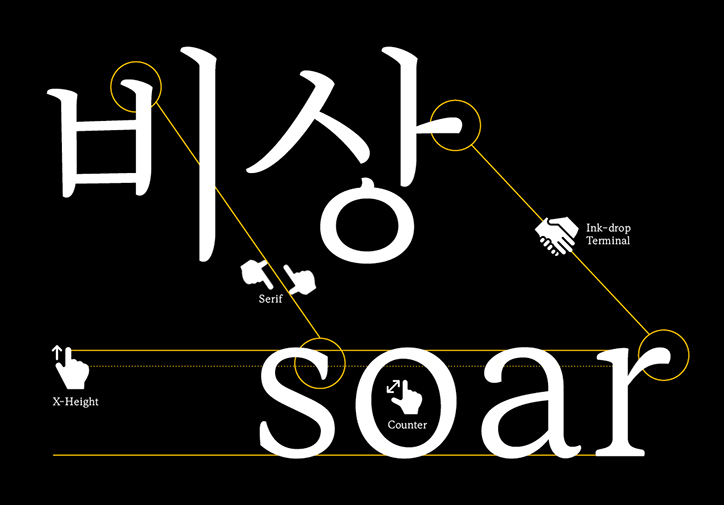
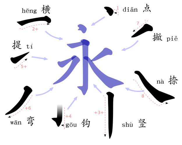
After the mention of the importance and purpose of the development of this kind of practice, it describes in detail the technical aspects of typography design and its correlation with language.

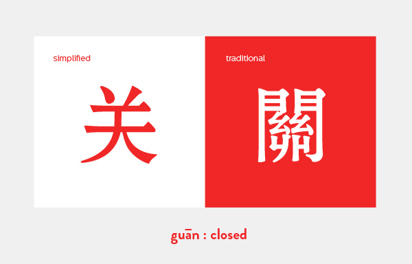
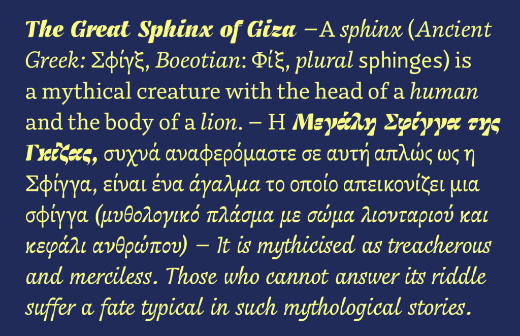
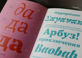
Then it focuses on multi-script typography, first examining its short history and big names with a following description of all the technical and esthetical specifications characteristic of these fonts. 

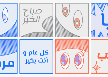
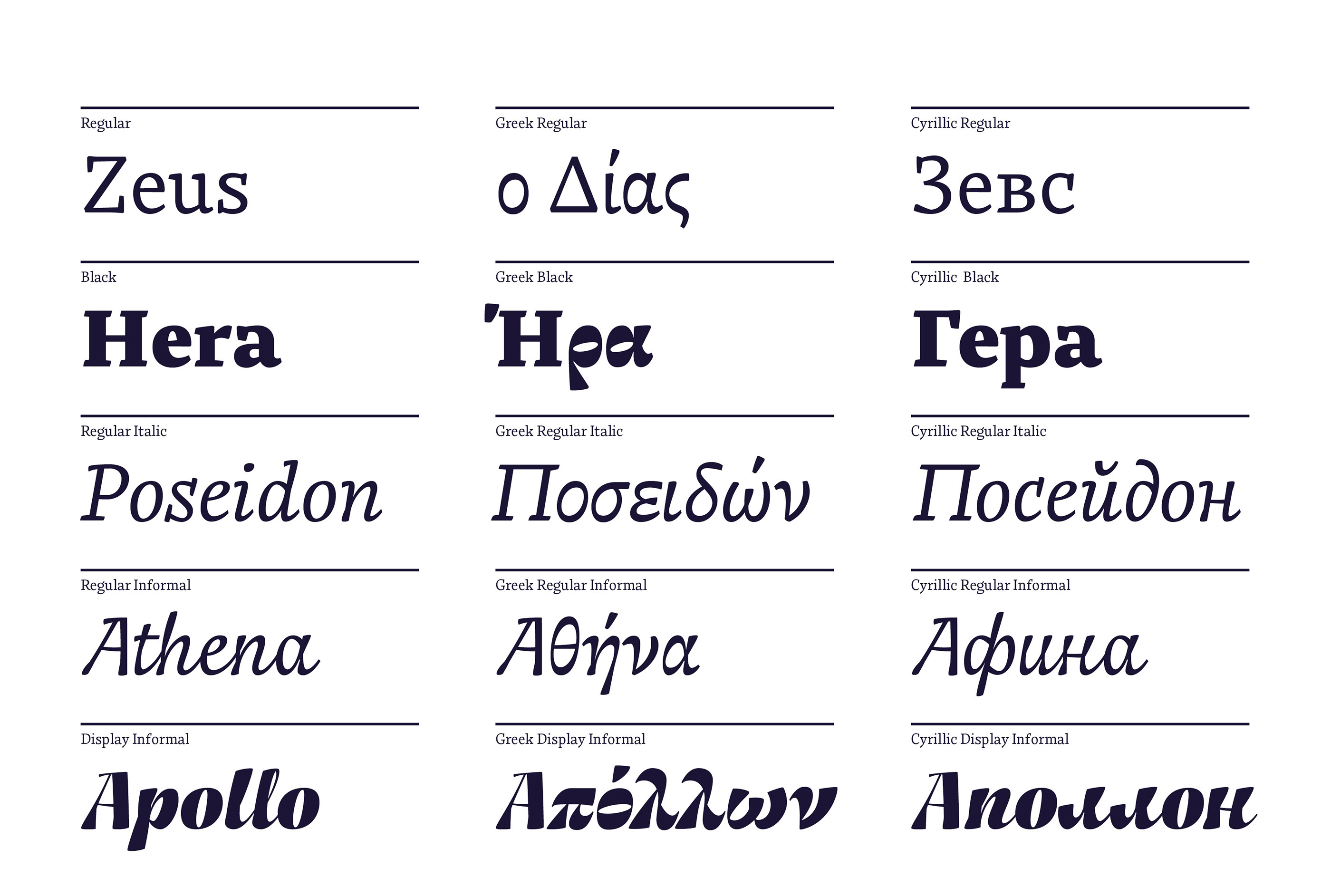
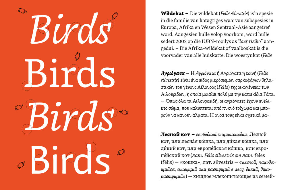
Next it compares particular cases of other languages like Arab or Latin, using all the parameters described in the previous chapters. Finally, it comes to an end with the conclusion and personal considerations.


Communication

Proper language characteristic of the design theory. It defines complicated terms and also uses technical vocabulary specific from its field. It is pleasant to read and very coherent.


Scale of work 

The thesis far-reaching and presents a broad research with the examination of specific cases, which need their own context and study. It is a great amount of work, even lacking of a practical part. However, it would be interesting to see the translation of the theoretical part into the design practice.


Orthography and accuracy

Really accurate writing, stylistic coherent and heterogeneous.


Bibliography

The project is based on a vast bibliography, characteristic of a theoretical master thesis. It includes materials found on books, magazines, websites and online publication. The themes are diverse including design, typography, philology, sociology and communication.

The sources are meticulously quoted and separated properly by different classes.


Designing with Chinese

Chinese writing has not much in common with the rules and proportions of Latin writing. It is based on a logographic script in which each symbol represents a word. Unlike the letters present in alphabets, its characters are used both for its pictographic meaning and phonetic pronunciation.

Bureau Borsche, Kaleidoscope Asia.

The language itself has experienced important changes in the last century resulting in two different variations of its writing system: Traditional and Simplified Chinese. After Mao’s revolution in the fifties, Mainland China began with the standardization of the language in order to raise literacy rates. Traditional Chinese requires a bigger amount of characters, which are also more complicated and detailed, and therefore more difficult to learn. Simplified Chinese is used today in Chinese speaking areas except from Hong Kong, Taiwan and Macau, which continue using traditional Chinese.

Kendra Schaefer, The Complete Beginner’s Guide to Chinese Fonts

The unit of the Chinese writing is the Chinese character or sinogram. There are 214 basic characters called radicals, which can be combined to form a great number of sinograms. In total, the Chinese language includes around 20.000 characters. To read it fluently, it is necessary to know 2000-3000 of them. But even more challenging, to read traditional Chinese requires to master around 10.000.

They writing process also works differently. Chinese characters or sinograms are built from a combination of strokes. The order of writing strokes is very important, as well as the meaning of each stroke, as the typographer Mak Kai Hang explains:

“we have to carefully process and adjust each stroke, if one stroke is out of place, the definition of a word or phrase completely changes. Consequently, designers draw on the specificities of the typographic language as “the main visual element” of a design to ensure there are no misunderstandings.

Mak Kai Heng [1]


Chinese-culture blog, The 8 basic strokes.

The visual and metrical proportions of the language contrast with almost every western script. They are almost like night and day. In Chinese, every character is based on square proportions and they all should fit in the same space. There are not upper and lower case, ascendant or descendant letters.

This characteristic is also really important when thinking about spacing, because Chinese words don’t require any space between them. Not even from paragraph to paragraph. The reader differentiates the words and sentences by the meaning of each character. However, there are certain punctuation signs indeed, but they use its own special spacing, which of course differs from Latin.

Ulrike Fesling, Mycrotypography research.

One of the most notable characteristics of Chinese, possibly the most famous one, is that it can be written in different directions. It is possible to write Chinese from up-to-down as well, which looks beautiful specially because of the proportions of its characters, which in the old times were meant to work in this direction. But today, the language is generally written from left-to-right as all Latin languages, leaving the up-to-down writing for a more traditional context. Moreover, this kind of writing implies technical specifications that require a special software, complicating its access to digital platforms.

Concerning typographic styles, Chinese fonts have their own classifications too, which are similar to western’s serif, sans serif or script. The two most commonly used are song ti, the so-called Chinese serif, and hei ti, similar to a sans-serif. They have different variations and sub-classifications like Latin typefaces with their own aesthetics and meaning, going from traditional to corporative of playful.

Song Ti


Hei Ti


Not surprising, designing with Chinese is really different than designing with any Latin language, especially for non-Chinese speakers, incapable of reading it or writing it. But it is completely possible, as long as the process is based on research, respect and continuous feedback from Chinese speakers.

[1] Mak Kai Hang discusses the typographic differences within Chinese graphic design https://www.itsnicethat.com/articles/mak-kai-hang-chinese-typography-graphic-design-191118

Bibliography

Chine culture http://www.chine-culture.com/

The Complete Beginner’s Guide to Chinese Fonts https://webdesign.tutsplus.com/articles/the-complete-beginners-guide-to-chinese-fonts–cms-23444

Ulrike Fesling, Mycrotypography research  http://www.multilingual-typography.com/microdesign.php

Pater, Robert.  The Politics of Design. A (Not so) Global Manual for Visual Communication. Bis Publishers, 2017.

Script combination


Multi-script typography is about making strangers cohabit the same visual environment without any unpleasant incidents. 

David Březina [1]

Language combination can bring up several difficulties, specially when working with different scripts at the same time. It means matching letterforms which follow other kind rules, but not knowing the rule is no excuse when it comes to communication. Designers should get to know the scripts they are working with beforehand in order to avoid unfortunate misinterpretations.

In projects that require the use of distinct writing systems, it is important to consider the special parameters that are specific to each of them. They would be written and read in different directions, use special glyphs, any punctuation signs… Their proportions can also be very different. For example, while calligraphic scripts like Arab are displayed within more horizontal dimensions, Latin consonants look always more vertical. Due to the way the letters join in the two scripts, their weight and stroke work different too, affecting the color and texture of the text, two important factors to consider in language combination.

Languages and writing systems affect the appearance of the paragraph. Even when combining languages that are written in the same script, they can behave different on the typographic page. As the typographer Robert Bringhurst points out, the frequency of different letters affects the texture of the text making some languages look smoother than another ones.[2] It is particularly noted on languages which use a large number of consonants or capital letters. This would be the case of German, in which the amount of ascendant and descendent letters – and of course the characteristic length of its words – will result in a different texture than English for example. Compared to other Latin languages, English is also a special case, due to the fact that it does not include diacritical marks such as accents in its writing. The contrast of its text texture with a language that uses many accents and special consonants would be significant on the page, but it could also work softly with a similar language like classic Latin.

Eps51 Studio, Right-to-Left

It is up to the designer to decide whether to emphasize the contrast between two different scripts and focus on the difference or try to make them work together and match them visually. But to archive an effective combination, both strategies should be always based on intend of use of the project itself. Generally, a dictionary and an art exhibition poster won’t have the same needs when it comes to hierarchy.

Eps51 Studio,  Bi-Scriptual 

This choice could be a result of a semantic approach, in which the level of contrast between the two languages is used to reinforce the message of the text and its meaning. In the same way the choice of a certain typeface can tell a different story based on its history or visual appearance, the contrast between languages, or the lack of it, can highlight a need of differentiation or homogeneity.

Carvalho Bernau,Typographic Matchmaking in the city

When a text includes words written in a different script, for example in Greek quotations, which require the use of special characters, the designer must also choose between homogeneity or contrast. One possibility is to use a typeface which holds all the characters needed for both scripts and provides a homogeneous texture. In this case, a multi-script font family would be a perfect match ensuring style consistency. But when a certain level of contrast is suitable for the text needs, the designer can also combine two different typefaces with contrast enough to highlight the foreign words. This would be a good solution if the main typeface does not include the special characters in its library.

Still it is important to avoid the combination of two typefaces in the same word, to fill the lack of special characters in the main font. It main sound odd at first, but it is a common choice when the desired font does not include diacritical marks or the complete Greek alphabet for example. The result is always a bizarre collage of letters which possibly do not share the same structure, proportions or style. It is the equivalent of forcing the use of small caps in a font that does not include them or the manual slant of a font to get the missing italics. It is a simple no-go for language combination, specially when thinking about the vast collection of multi-language and multi-script typefaces available today.

In short, fine script combination comes from visual sensibility. Both contrast or homogeneity strategies should pursue a harmonic page, in which the scripts used are balanced but maintain their own personalities and values.

Franziska Hubmann, Bynx Font Specimen

[1] What is Multi-script typography all about?  Interview by Rosetta type foundry https://www.rosettatype.com/blog/2013/02/05/What-is-multiscript-typography

[2] Bringhurst, Robert. The Elements of Typographic Style (page 93).

Images

1 Anna Kulachek, Strelka Institute http://kulachek.com/HSU-at-Strelka-Institute

2 Eps51 Studio, Right-to-Left Exhibition https://www.eps51.com/projects/right-to-left-exhibition/

3 Eps51 Studio,  Bi-Scriptual https://www.eps51.com/projects/bi-scriptual/

4 Carvalho Bernau,Typographic Matchmaking in the city http://carvalho-bernau.com/typographic-matchmaking/

5 Franziska Hubmann, Bynx Font Specimen. https://www.behance.net/gallery/61480511/Typeface-Bynx

Technology and script

Multilingual communication presents some obstacles on its written form that can be beautifully solved by the use of typography. Multi-script typefaces represent a better access to written communication across countries, languages and scripts.

Some decades ago, it was difficult to find typefaces that included all the special glyphs necessary for writing in every Latin language. Symbols such as accents, combined letters, hyphens or phonetic consonants were not included in the basic Latin alphabet but are still used in many Languages. Although they were soon available for languages like German, French or Spanish, designers working with texts in Polish, Czech, Turkish or even Catalan had lots of trouble when trying to find special glyphs in the character sets of their font library. In many cases they had to make countless adjustments or draw new symbols themselves.

As the typographer Onur F. Yazicigil explains in an interview with Slanted Magazine[1], Turkish designers started to add the missing letters to their desired fonts to face the exclusion of special glyphs required for writing in Turkish language. This was a common situation in many other languages and resulted in a vast collection of customized glyphs across cultures.

But for countries using a different script than Latin, this lack of characters also meant a barrier to their access to technology. Whereas computer science has always been English-based, users around the world wanted to communicate in their own languages as well. The main obstacle they had to face was the absence of a software able to process the huge number of characters required in many languages like Arab, Chinese or Devanagari. It was not till the recent development of new technologies such as Unicode and OpenType, that computer environments became purely multilingual and were finally able to include more than 65.000 glyphs or symbols in a single font file. That means that today any user can easily acquire a font package that includes all the necessary glyphs to write in several writing systems without any software inconvenience.

Google fonts have been working on this matter since 2010 expanding its library to Eastern scripts featuring Korean, Devanagari, Arab, Hebrew…

Every year for the last several years, millions of people have gotten their first computer as a smart phone and use that to access the internet. It’s necessary for them to have as good an experience expressing themselves through typography as they would in English.”[2]

Dave Crossland, the program manager for Google Fonts.

With projects as Noto Fonts [3]  they want to provide fonts in Unicode for every language, as a response to a growing industry, which demands typefaces that represent our multilingual reality. Google fonts is a great example of the role of typography and script for inclusion and cultural diversity in global communication.

Multi-script typography is possible thanks to these new technological developments which allowed type designers to elaborate new typefaces from a multilingual perspective. They are now encouraged to bring a fresh approach to type design and make it through Latin and Western-based type scene.  


[1] Slanted Magazine, Issue 24 Istambul, 2015. Interview available on https://vimeo.com/109686747

[2] Google Wants to Make Web Fonts Accessible All Over the World https://eyeondesign.aiga.org/google-wants-to-make-web-fonts-accessible-all-over-the-world/

[3] Noto Fonts https://www.google.com/get/noto/


Images

1 Google Fonts, Modernizing Arabic Type for a Digital Audience https://design.google/library/modernizing-arabic-typography-type-design/

2 Rosetta Foundry, Skolar Sans Specimen https://www.rosettatype.com/SkolarSans#cyrillic


Multi-script typography

In typography, multilingualism means handling different scripts every now and then. In the recent years the need of better fonts specially designed for this purpose has opened a new field on typography based on the so-called multi-script typography.

Multi-script typography refers to typefaces which include more than one writing system in their character set. These fonts support not only Latin but also Cyrillic, Arab, Devanagari…and therefore, all the languages that require the use of these writing systems. We could think of them as big font families in which each style (regular, bold, italic…) has its equivalent in different scripts. For example, it allows the designer to switch easily between Latin and Greek in the same text, using a single font file.

These typefaces are designed to work properly in each of the scripts they hold based on their own linguistic parameters, which will facilitate the correct use of each language. They are a great tool for multilingual design and cultural exchange.

Mingoo Yoon, Yoonseul Batang

Franziska Hubmann, Bynx Font Specimen

The design of a multi-script typeface is a tough task that requires ample knowledge in typography, metrics, orthography and also in the cultural conventions belonging to each script. It is considerably more difficult than the design of a mono-script typeface. In words of the typographer David Březina[1]:

“When designing multilingual type families, designers face challenges on the crossroads of linguistics, typography, and computer science.”

During the design process, type designers need to take into account the specific parameters of each script. Even when sharing similar roots or visual appearance, they are structurally different. They can be use special diacritical marks, not distinguish between upper and lower case, use different spacing…These aspects can be more than a headache when it comes to the harmonization of the different scripts, in other words, when trying to make them match visually. Sometimes the difficulties may also be a matter of technology limitations concerning the writing directions or the inclusion of special glyphs.

In the case of the graphic designer, even if using a multi-script typeface, language combination will imply several difficulties, specially when combining different writing systems. Each script has different proportions that should be matched visually, better than mathematically, in order to build an harmonic page. It can be a laborious task that requires cultural sensibility and sound research to avoid pastiche and misinterpretation.

Franziska Hubmann, Bynx Font Specimen


[1] David Březina, Challenges in multilingual type design  http://www.typoday.in/2012/spk_papers/david-brezina-typographyday2012.pdf

Images:

1,3,4 Franziska Hubmann, Bynx Font Specimen. https://www.behance.net/gallery/61480511/Typeface-Bynx

2 Mingoo Yoon, Yoonseul Batang https://www.itsnicethat.com/articles/mingoo-yoon-bi-scriptual-typgography-graphic-design-030119?utm_source=weeklyemail&utm_medium=email&utm_campaign=intemail


Language and Script in Europe

Nowadays multilingualism is playing an important role in communication media, as a result of globalisation and the increasing interaction of different cultures around the world. Designers are facing new typographic challenges, when working with not only different languages but also with multiple scripts and language systems, each of them with distinct visual precepts and habits.

Taking the European context as starting point of this research and also, a good example of multilingualism, it is interesting to consider that there are currently 23 officially recognised languages within the European Union, as well as over 60 regional minority languages spoken by approximately 40 million of people. Half of Europeans are able to handle a conversation in at least one additional language, besides their mother tongue, which for most would be English, as the undoubtedly lingua franca of today’s society. Moreover, a quarter of Europeans are able to speak a third language, and a few are fluent even in a forth.

This multilingual scenario is really common in countries like Spain, Belgium or Croatia, in which the coexistence of several official languages, influence not only the daily life of their citizens but also the urban landscape through city signs or printed media.

Comparison of Spanish and Catalan texts.

In the field of design, these language requirements will affect typographic aspects of digital and printed media, when combining two or even three languages. The particularities of each language include the use special glyphs or the variation orthographic rules. This will often mean a different use of form and space while working with text and will need several typographic adjustments. For example, in German based designs, the length of the words is really significant in comparison with English or French. Non-German speakers would have a tough time if they try to use the same type and paragraph parameters they would use in their own languages. A similar phenomenon occurs with Spanish and Catalan words. Although the two languages are really similar and come from Latin roots, Catalan happens to be longer than Spanish, and also includes different glyphs and word structures which will influence the final design.

But to consider multilingualism in Europe, it is really important to have a look on the Balkan countries as a significant example of language coexistence. Within Croatia, Bosnia and Montenegro, there are up to four official languages which are used simultaneously in public communications. Nevertheless, while Bosnian, Croatian and Montenegrin are written in Latin script, Serbian (which is featured as one of the official languages in these countries) is traditionally written in Cyrillic script. Indeed, Cyrillic is broadly used in Europe far from the Russian borders and is not only owned by the Russian language. The confusion is understandable considering that Russia includes the biggest number of Cyrillic users, but this script is actually used to write over 50 languages, including Serbian and Ukrainian.

Three scripts were historically used in the former Yugoslavia: Cyrillic, Latin and Glagolitic, also agents of cultural, religious and political identities. The parallel development and coexistence of the Yugoslavian languages resulted in shared features which make western Balkan languages really similar to each other, although written in different scripts.

The concurrence of this languages across countries often leads to political misunderstandings at a time of separation and division. With a multilingual background, the designers Marija Juza and Nikola Djurek developed in 2012 Balkan, a bi-scriptural typeface meant to create unity and reconciliation in favour of education, tolerance and communication. The typeface is designed to combine both Latin and Cyrillic scripts for the transliteration of Croatian and Serbian, inspired in a phenomenon known as “The Balkan Sprachbund”, based on the linguistic features shared between different languages because of proximity. It uses single, shared glyphs to represent the sounds of both languages and allow users who don’t know Cyrillic to read texts in both scripts at the same time. Undoubtedly, a good tool for learning about different scripts and bring languages together.

Balkan Type Specimen by Nikola Djurek and Marija Juza

The combination of different scripts would be a struggle for those designers who were Latin based. Although several characters may seem familiar, they include its own orthographic rules and variations, which should be considered before starting to work with typography and layout. Cyrillic looks really beautiful and appealing, especially considering its geometric and regular shape, really different from Latin ascendant and descendant letters. Considering the vast number of languages in Europe, it may be a good moment for designers to explore their orthographic and script requirements as a challenge for their typographic knowledge.

FS Sally Pro Specimens in Latin, Cyrillic and Greek

Bibliography:

https://www.fontsmith.com/blog/2017/05/24/4-things-every-graphic-designer-needs-to-know-about-cyrillic

https://www.typotheque.com/fonts/balkan_sans/about

https://europa.eu/european-union/topics/multilingualism_en

https://www.theguardian.com/news/datablog/2014/sep/26/europeans-multiple-languages-uk-ireland

Image: 

  1. Tata & Friends, Plazida https://tatafriends.com/Plazida
  2. Fundación Mainel, ODS, Miradas desde la ilustración.  Irene Martínez & Salva Antón. ( Personal Work)
  3. Balkan type specimen https://www.typotheque.com/books/balkan_type_specimen
  4.  FS Sally Pro https://www.fontsmith.com/blog/2016/09/21/fontsmith-respond-to-increase-in-demand-for-global-language-support-with-fs-sally-pro

Multilingual Design

Today about seven thousand languages are spoken in the world. Communicating in multiple languages is becoming more and more common and is bringing up new challenges to the practice of design, specially from a typographic perspective.

Multilingual projects often require the combination of different scripts, which is a usual scenario in countries handling Arabic, Chinese or Cyrillic writing systems. Current type design is responding to the growing demand of multilingual media with the design of typefaces that feature not one but multiple scripts in their character sets.

As projects keep reaching worldwide audiences, designers need to merge with foreign values and communication systems to create an effective discourse, particularly when working with an unknown script. Using multiple languages at the same time can become a form of cultural and emotional expression in design and allow a fresh view which engage a global audience.

But how should designers face multicultural projects? What are the benefits brought by the interaction multiple languages in design practice? In the following posts I would like to focus on the combination of languages in design practice, from methodology to typographic aspects.

Image 

Laura Meseger. Qandus, a triscript typeface family.

Bibliography

Pater, Robert.  The Politics of Design. A (Not so) Global Manual for Visual Communication. Bis Publishers, 2017.

Rymer, Russ. „Vanishing Languages“. National Geographic. July, 2012. https://www.nationalgeographic.com/magazine/2012/07/vanishing-languages/