Chinese writing has not much in common with the rules and proportions of Latin writing. It is based on a logographic script in which each symbol represents a word. Unlike the letters present in alphabets, its characters are used both for its pictographic meaning and phonetic pronunciation.
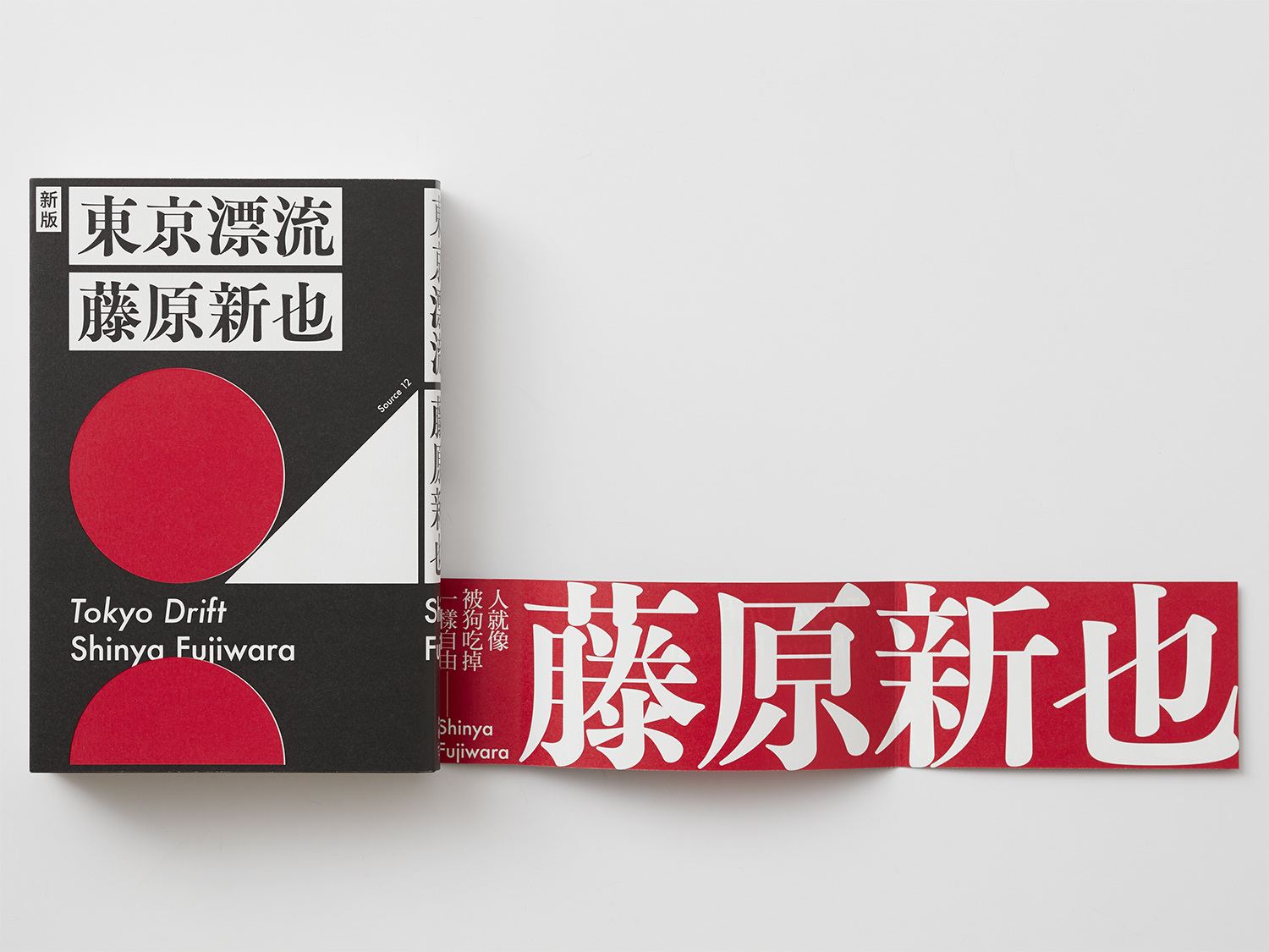
Bureau Borsche, Kaleidoscope Asia.
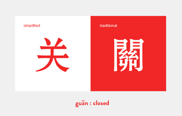
The language itself has experienced important changes in the last century resulting in two different variations of its writing system: Traditional and Simplified Chinese. After Mao’s revolution in the fifties, Mainland China began with the standardization of the language in order to raise literacy rates. Traditional Chinese requires a bigger amount of characters, which are also more complicated and detailed, and therefore more difficult to learn. Simplified Chinese is used today in Chinese speaking areas except from Hong Kong, Taiwan and Macau, which continue using traditional Chinese.
Kendra Schaefer, The Complete Beginner’s Guide to Chinese Fonts
The unit of the Chinese writing is the Chinese character or sinogram. There are 214 basic characters called radicals, which can be combined to form a great number of sinograms. In total, the Chinese language includes around 20.000 characters. To read it fluently, it is necessary to know 2000-3000 of them. But even more challenging, to read traditional Chinese requires to master around 10.000.
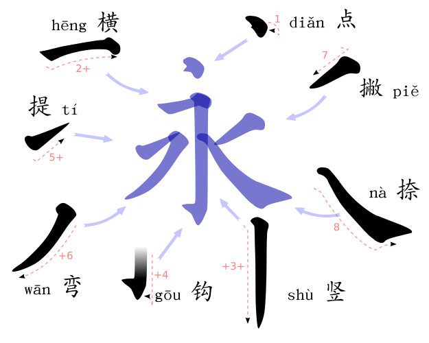
They writing process also works differently. Chinese characters or sinograms are built from a combination of strokes. The order of writing strokes is very important, as well as the meaning of each stroke, as the typographer Mak Kai Hang explains:
“we have to carefully process and adjust each stroke, if one stroke is out of place, the definition of a word or phrase completely changes. Consequently, designers draw on the specificities of the typographic language as “the main visual element” of a design to ensure there are no misunderstandings.
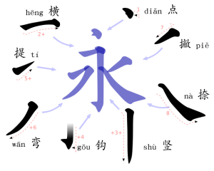
Chinese-culture blog, The 8 basic strokes.
The visual and metrical proportions of the language contrast with almost every western script. They are almost like night and day. In Chinese, every character is based on square proportions and they all should fit in the same space. There are not upper and lower case, ascendant or descendant letters.
This characteristic is also really important when thinking about spacing, because Chinese words don’t require any space between them. Not even from paragraph to paragraph. The reader differentiates the words and sentences by the meaning of each character. However, there are certain punctuation signs indeed, but they use its own special spacing, which of course differs from Latin.

 Ulrike Fesling, Mycrotypography research.
One of the most notable characteristics of Chinese, possibly the most famous one, is that it can be written in different directions. It is possible to write Chinese from up-to-down as well, which looks beautiful specially because of the proportions of its characters, which in the old times were meant to work in this direction. But today, the language is generally written from left-to-right as all Latin languages, leaving the up-to-down writing for a more traditional context. Moreover, this kind of writing implies technical specifications that require a special software, complicating its access to digital platforms.
Concerning typographic styles, Chinese fonts have their own classifications too, which are similar to western’s serif, sans serif or script. The two most commonly used are song ti, the so-called Chinese serif, and hei ti, similar to a sans-serif. They have different variations and sub-classifications like Latin typefaces with their own aesthetics and meaning, going from traditional to corporative of playful.
Song Ti
Hei Ti
Not surprising, designing with Chinese is really different than designing with any Latin language, especially for non-Chinese speakers, incapable of reading it or writing it. But it is completely possible, as long as the process is based on research, respect and continuous feedback from Chinese speakers.
[1] Mak Kai Hang discusses the typographic differences within Chinese graphic design https://www.itsnicethat.com/articles/mak-kai-hang-chinese-typography-graphic-design-191118
Bibliography
Chine culture http://www.chine-culture.com/
The Complete Beginner’s Guide to Chinese Fonts https://webdesign.tutsplus.com/articles/the-complete-beginners-guide-to-chinese-fonts–cms-23444
Ulrike Fesling, Mycrotypography research http://www.multilingual-typography.com/microdesign.php
Pater, Robert. The Politics of Design. A (Not so) Global Manual for Visual Communication. Bis Publishers, 2017.