
In typography, multilingualism means handling different scripts every now and then. In the recent years the need of better fonts specially designed for this purpose has opened a new field on typography based on the so-called multi-script typography.
Multi-script typography refers to typefaces which include more than one writing system in their character set. These fonts support not only Latin but also Cyrillic, Arab, Devanagari…and therefore, all the languages that require the use of these writing systems. We could think of them as big font families in which each style (regular, bold, italic…) has its equivalent in different scripts. For example, it allows the designer to switch easily between Latin and Greek in the same text, using a single font file.
These typefaces are designed to work properly in each of the scripts they hold based on their own linguistic parameters, which will facilitate the correct use of each language. They are a great tool for multilingual design and cultural exchange.
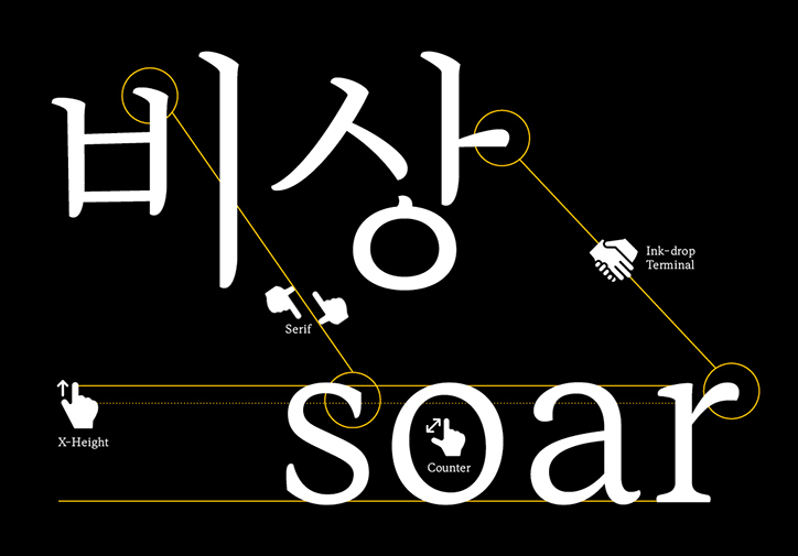
Mingoo Yoon, Yoonseul Batang
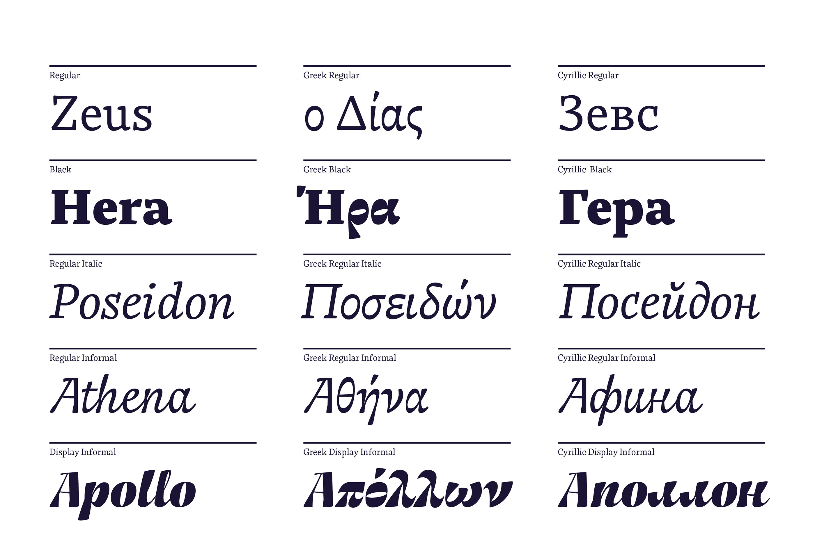
Franziska Hubmann, Bynx Font Specimen
The design of a multi-script typeface is a tough task that requires ample knowledge in typography, metrics, orthography and also in the cultural conventions belonging to each script. It is considerably more difficult than the design of a mono-script typeface. In words of the typographer David Březina[1]:
“When designing multilingual type families, designers face challenges on the crossroads of linguistics, typography, and computer science.”
During the design process, type designers need to take into account the specific parameters of each script. Even when sharing similar roots or visual appearance, they are structurally different. They can be use special diacritical marks, not distinguish between upper and lower case, use different spacing…These aspects can be more than a headache when it comes to the harmonization of the different scripts, in other words, when trying to make them match visually. Sometimes the difficulties may also be a matter of technology limitations concerning the writing directions or the inclusion of special glyphs.
In the case of the graphic designer, even if using a multi-script typeface, language combination will imply several difficulties, specially when combining different writing systems. Each script has different proportions that should be matched visually, better than mathematically, in order to build an harmonic page. It can be a laborious task that requires cultural sensibility and sound research to avoid pastiche and misinterpretation.
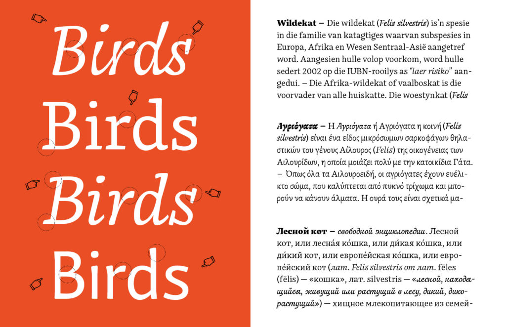
Franziska Hubmann, Bynx Font Specimen
[1] David Březina, Challenges in multilingual type design http://www.typoday.in/2012/spk_papers/david-brezina-typographyday2012.pdf
Images:
1,3,4 Franziska Hubmann, Bynx Font Specimen. https://www.behance.net/gallery/61480511/Typeface-Bynx
2 Mingoo Yoon, Yoonseul Batang https://www.itsnicethat.com/articles/mingoo-yoon-bi-scriptual-typgography-graphic-design-030119?utm_source=weeklyemail&utm_medium=email&utm_campaign=intemail