There are a lot of places where Murals have proven to convey unification, history and culture inside a community. In Northern Ireland around 2.000 murals are depicted on fences an buildings, still telling stories of the troubles of former times. Most of those can be find in Belfast, with over 700 wall paintings.
Kategorie: Communication Design
Communication Design

Achtsamkeit beschleunigt den Designprozess
Achtsamkeit ist im Grunde nichts, das man aufwändig lernen muss. Es ist eigentlich ganz einfach. Achtsamkeit bedeutet, dass man sich im hier und jetzt befindet d.h. man ist hier und jetzt bei sich selbst und der Aufgabe, die zu erledigen ist. Das einzige, dass dabei eventuell noch zu erlernen ist ist ein eindeutiges „Nein“.

Ästhetik, Messbarkeit und Kompositionselemente auf Instagram
Nachdem festgestellt wurde, dass es Nutzertypen mit eindeutigen Präferenzen bzgl. Themenauswahl und Motivation gibt, gilt es Gestaltungselemente und themenbezogene Gegenstände herauszufiltern. Anhand der optischen Wiederholungen wird klar, dass bei gewissen Motiven entsprechend einschlägige Objekte auftreten. Das einfachste Beispiel ist Food-Photography: kreisrunde Formen und Teller, Gläsern und weitere Besteckutensilien sind in nahezu jedem Bild enthalten. Der Hinter-/Untergrund ist meist monochrom gehalten, dem Tischmaterial entsprechende Braun- und Grautöne überwiegen. Anhand der genutzten Hashtags lassen sich die häufigsten Objekte herausfiltern und nachweisen.
Traditionelle Animation Test
Eine kleine Animation als Content für Instagram oder Facebook wurde erstellt. Sehr simpel gehalten, funktioniert dennoch gut durch Farbwirkung und Texturen.
Das Verständnis von kleinen Animationen hat sich in den letzten Wochen gefestigt und somit ist das nächste Ziel eine etwas größere Abfolge von Animationen zu gestalten. Das ultimative Ziel entwickelte sich vorerst als illustrierter und animierter Kurzfilm, hierzu einige Beispiele zur Inspiration:
Script combination
Multi-script typography is about making strangers cohabit the same visual environment without any unpleasant incidents.
David Březina [1]
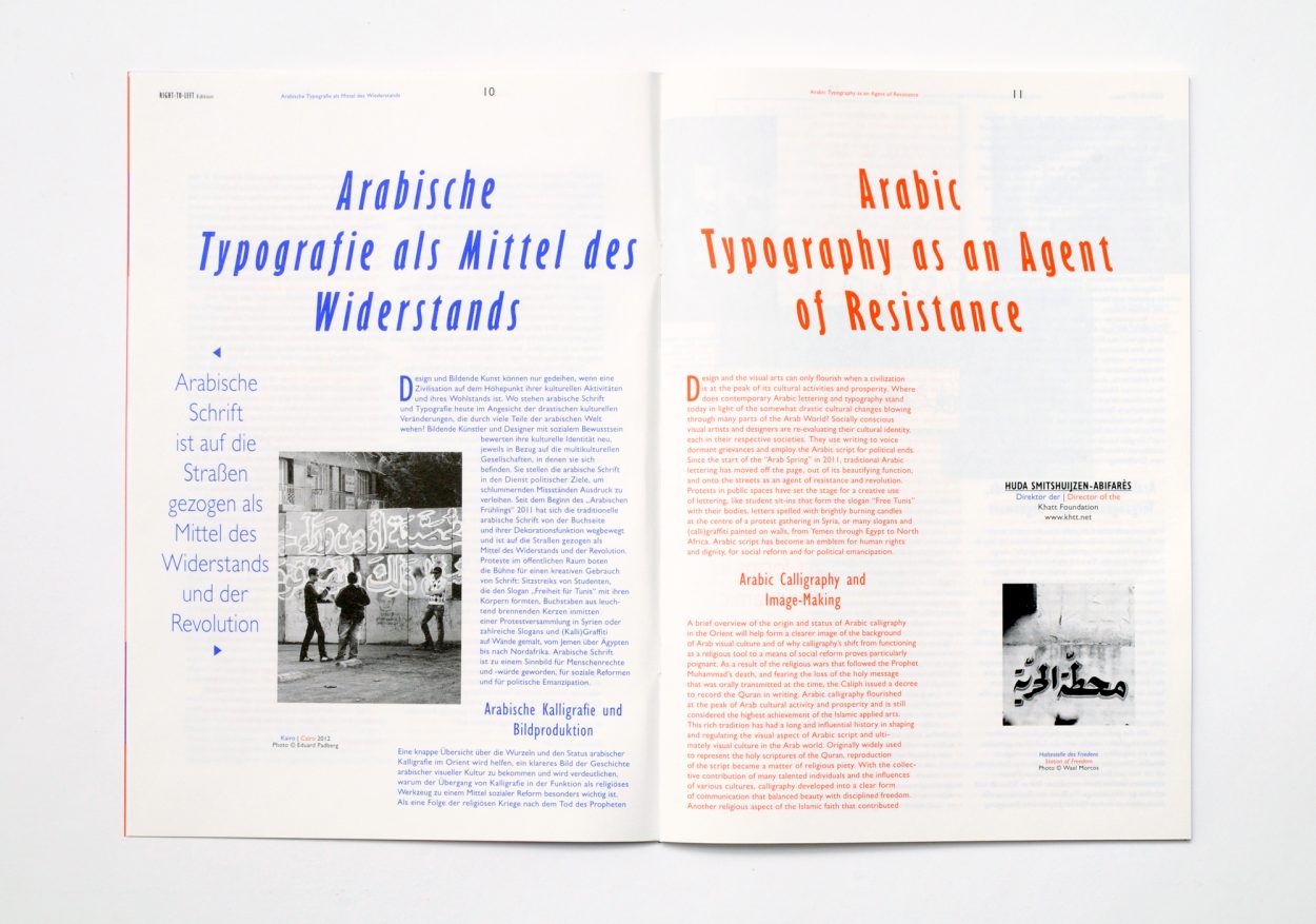
Language combination can bring up several difficulties, specially when working with different scripts at the same time. It means matching letterforms which follow other kind rules, but not knowing the rule is no excuse when it comes to communication. Designers should get to know the scripts they are working with beforehand in order to avoid unfortunate misinterpretations.
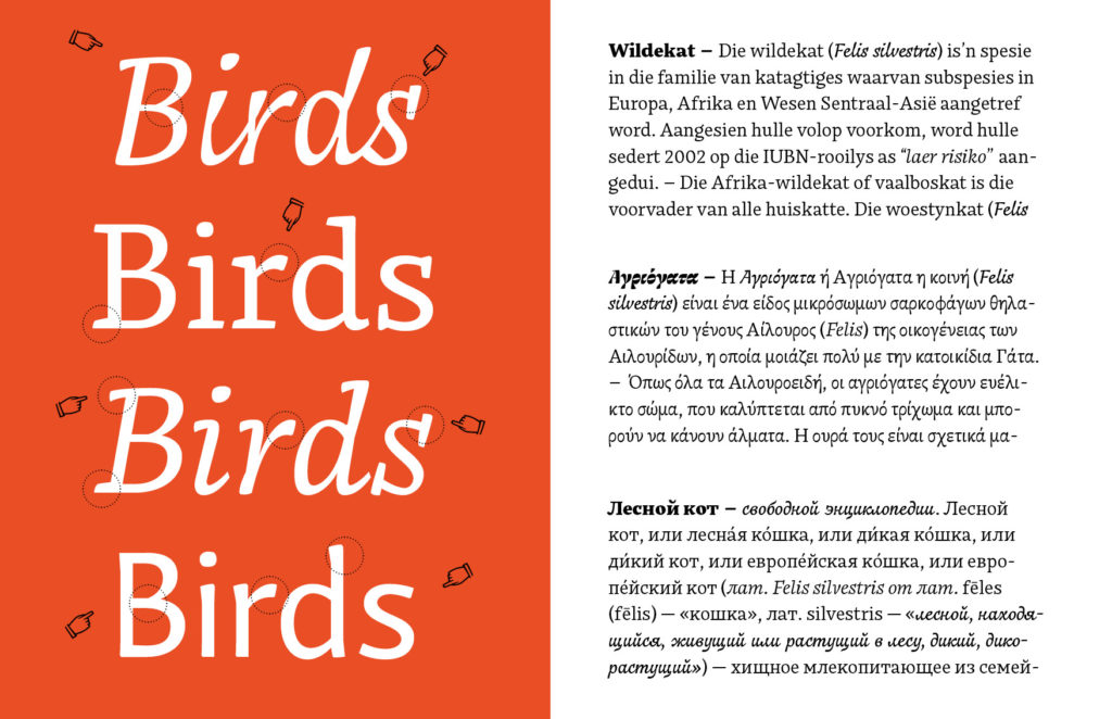
In projects that require the use of distinct writing systems, it is important to consider the special parameters that are specific to each of them. They would be written and read in different directions, use special glyphs, any punctuation signs… Their proportions can also be very different. For example, while calligraphic scripts like Arab are displayed within more horizontal dimensions, Latin consonants look always more vertical. Due to the way the letters join in the two scripts, their weight and stroke work different too, affecting the color and texture of the text, two important factors to consider in language combination.
Languages and writing systems affect the appearance of the paragraph. Even when combining languages that are written in the same script, they can behave different on the typographic page. As the typographer Robert Bringhurst points out, the frequency of different letters affects the texture of the text making some languages look smoother than another ones.[2] It is particularly noted on languages which use a large number of consonants or capital letters. This would be the case of German, in which the amount of ascendant and descendent letters – and of course the characteristic length of its words – will result in a different texture than English for example. Compared to other Latin languages, English is also a special case, due to the fact that it does not include diacritical marks such as accents in its writing. The contrast of its text texture with a language that uses many accents and special consonants would be significant on the page, but it could also work softly with a similar language like classic Latin.
Eps51 Studio, Right-to-Left
It is up to the designer to decide whether to emphasize the contrast between two different scripts and focus on the difference or try to make them work together and match them visually. But to archive an effective combination, both strategies should be always based on intend of use of the project itself. Generally, a dictionary and an art exhibition poster won’t have the same needs when it comes to hierarchy.
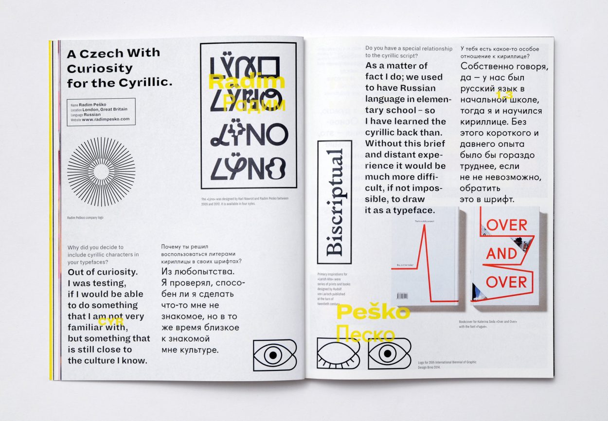
Eps51 Studio, Bi-Scriptual
This choice could be a result of a semantic approach, in which the level of contrast between the two languages is used to reinforce the message of the text and its meaning. In the same way the choice of a certain typeface can tell a different story based on its history or visual appearance, the contrast between languages, or the lack of it, can highlight a need of differentiation or homogeneity.
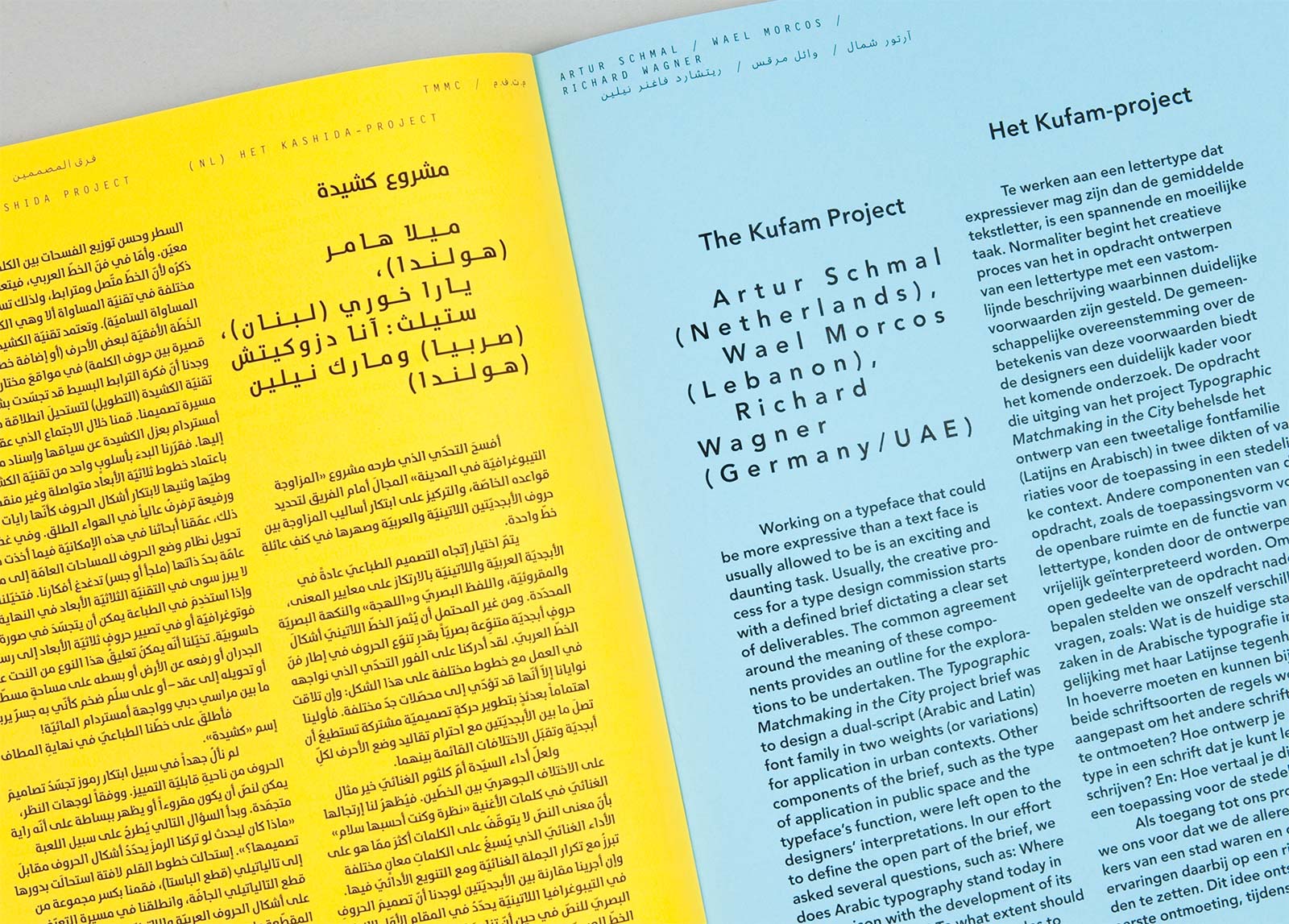
Carvalho Bernau,Typographic Matchmaking in the city
When a text includes words written in a different script, for example in Greek quotations, which require the use of special characters, the designer must also choose between homogeneity or contrast. One possibility is to use a typeface which holds all the characters needed for both scripts and provides a homogeneous texture. In this case, a multi-script font family would be a perfect match ensuring style consistency. But when a certain level of contrast is suitable for the text needs, the designer can also combine two different typefaces with contrast enough to highlight the foreign words. This would be a good solution if the main typeface does not include the special characters in its library.
Still it is important to avoid the combination of two typefaces in the same word, to fill the lack of special characters in the main font. It main sound odd at first, but it is a common choice when the desired font does not include diacritical marks or the complete Greek alphabet for example. The result is always a bizarre collage of letters which possibly do not share the same structure, proportions or style. It is the equivalent of forcing the use of small caps in a font that does not include them or the manual slant of a font to get the missing italics. It is a simple no-go for language combination, specially when thinking about the vast collection of multi-language and multi-script typefaces available today.
In short, fine script combination comes from visual sensibility. Both contrast or homogeneity strategies should pursue a harmonic page, in which the scripts used are balanced but maintain their own personalities and values.
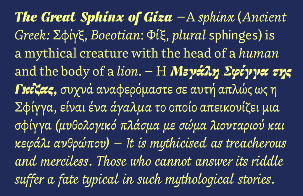
Franziska Hubmann, Bynx Font Specimen
[1] What is Multi-script typography all about? Interview by Rosetta type foundry https://www.rosettatype.com/blog/2013/02/05/What-is-multiscript-typography
[2] Bringhurst, Robert. The Elements of Typographic Style (page 93).
Images
1 Anna Kulachek, Strelka Institute http://kulachek.com/HSU-at-Strelka-Institute
2 Eps51 Studio, Right-to-Left Exhibition https://www.eps51.com/projects/right-to-left-exhibition/
3 Eps51 Studio, Bi-Scriptual https://www.eps51.com/projects/bi-scriptual/
4 Carvalho Bernau,Typographic Matchmaking in the city http://carvalho-bernau.com/typographic-matchmaking/
5 Franziska Hubmann, Bynx Font Specimen. https://www.behance.net/gallery/61480511/Typeface-Bynx
Technology and script
Multilingual communication presents some obstacles on its written form that can be beautifully solved by the use of typography. Multi-script typefaces represent a better access to written communication across countries, languages and scripts.
Some decades ago, it was difficult to find typefaces that included all the special glyphs necessary for writing in every Latin language. Symbols such as accents, combined letters, hyphens or phonetic consonants were not included in the basic Latin alphabet but are still used in many Languages. Although they were soon available for languages like German, French or Spanish, designers working with texts in Polish, Czech, Turkish or even Catalan had lots of trouble when trying to find special glyphs in the character sets of their font library. In many cases they had to make countless adjustments or draw new symbols themselves.
As the typographer Onur F. Yazicigil explains in an interview with Slanted Magazine[1], Turkish designers started to add the missing letters to their desired fonts to face the exclusion of special glyphs required for writing in Turkish language. This was a common situation in many other languages and resulted in a vast collection of customized glyphs across cultures.
But for countries using a different script than Latin, this lack of characters also meant a barrier to their access to technology. Whereas computer science has always been English-based, users around the world wanted to communicate in their own languages as well. The main obstacle they had to face was the absence of a software able to process the huge number of characters required in many languages like Arab, Chinese or Devanagari. It was not till the recent development of new technologies such as Unicode and OpenType, that computer environments became purely multilingual and were finally able to include more than 65.000 glyphs or symbols in a single font file. That means that today any user can easily acquire a font package that includes all the necessary glyphs to write in several writing systems without any software inconvenience.
Google fonts have been working on this matter since 2010 expanding its library to Eastern scripts featuring Korean, Devanagari, Arab, Hebrew…
“Every year for the last several years, millions of people have gotten their first computer as a smart phone and use that to access the internet. It’s necessary for them to have as good an experience expressing themselves through typography as they would in English.”[2]
Dave Crossland, the program manager for Google Fonts.
With projects as Noto Fonts [3] they want to provide fonts in Unicode for every language, as a response to a growing industry, which demands typefaces that represent our multilingual reality. Google fonts is a great example of the role of typography and script for inclusion and cultural diversity in global communication.
Multi-script typography is possible thanks to these new technological developments which allowed type designers to elaborate new typefaces from a multilingual perspective. They are now encouraged to bring a fresh approach to type design and make it through Latin and Western-based type scene.
[1] Slanted Magazine, Issue 24 Istambul, 2015. Interview available on https://vimeo.com/109686747
[2] Google Wants to Make Web Fonts Accessible All Over the World https://eyeondesign.aiga.org/google-wants-to-make-web-fonts-accessible-all-over-the-world/
[3] Noto Fonts https://www.google.com/get/noto/
Images
1 Google Fonts, Modernizing Arabic Type for a Digital Audience https://design.google/library/modernizing-arabic-typography-type-design/
2 Rosetta Foundry, Skolar Sans Specimen https://www.rosettatype.com/SkolarSans#cyrillic
Multi-script typography
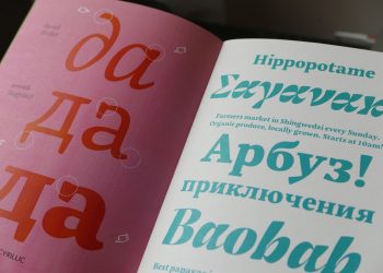
In typography, multilingualism means handling different scripts every now and then. In the recent years the need of better fonts specially designed for this purpose has opened a new field on typography based on the so-called multi-script typography.
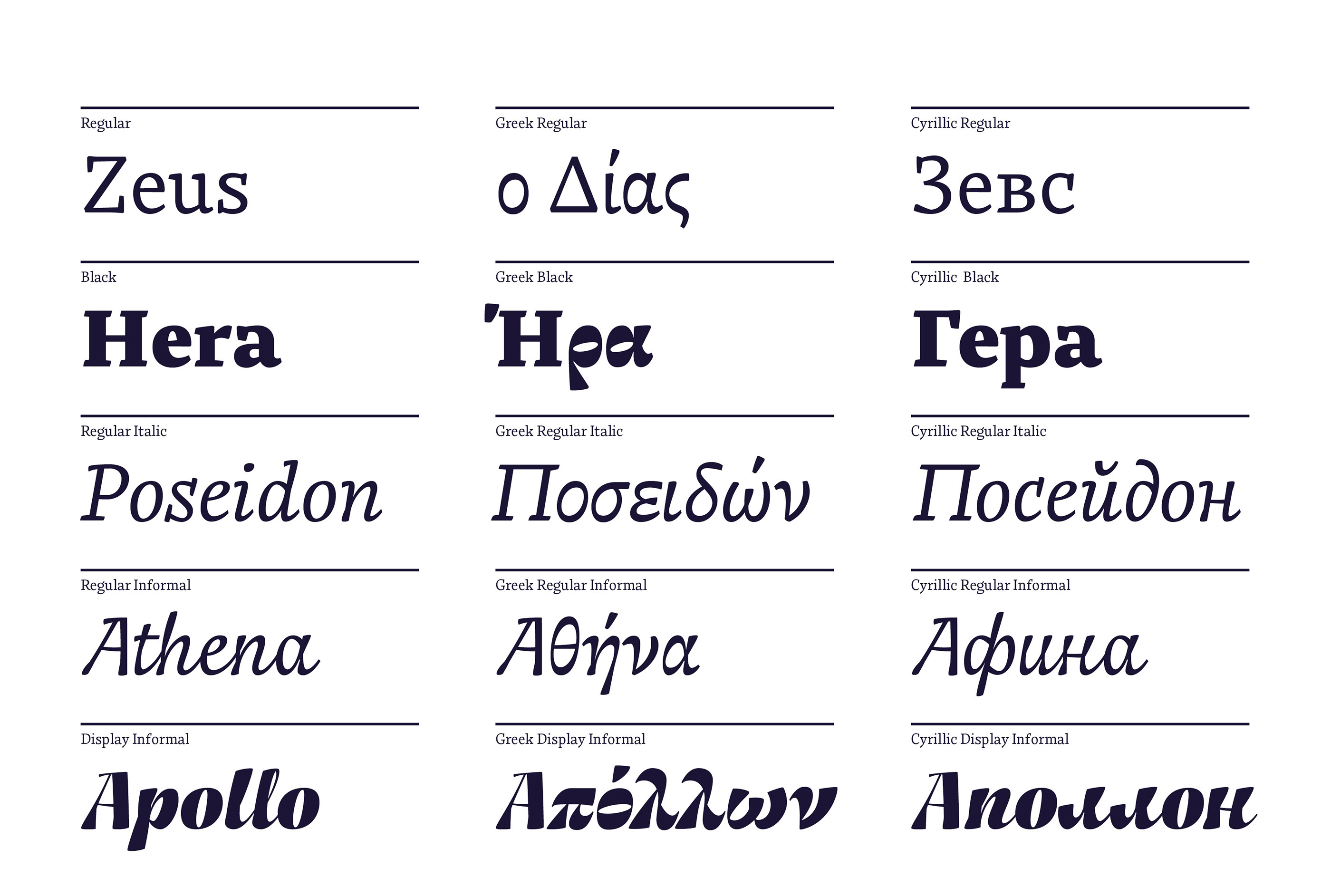
Multi-script typography refers to typefaces which include more than one writing system in their character set. These fonts support not only Latin but also Cyrillic, Arab, Devanagari…and therefore, all the languages that require the use of these writing systems. We could think of them as big font families in which each style (regular, bold, italic…) has its equivalent in different scripts. For example, it allows the designer to switch easily between Latin and Greek in the same text, using a single font file.
These typefaces are designed to work properly in each of the scripts they hold based on their own linguistic parameters, which will facilitate the correct use of each language. They are a great tool for multilingual design and cultural exchange.
Mingoo Yoon, Yoonseul Batang
Franziska Hubmann, Bynx Font Specimen
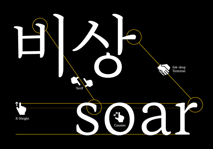
The design of a multi-script typeface is a tough task that requires ample knowledge in typography, metrics, orthography and also in the cultural conventions belonging to each script. It is considerably more difficult than the design of a mono-script typeface. In words of the typographer David Březina[1]:
“When designing multilingual type families, designers face challenges on the crossroads of linguistics, typography, and computer science.”
During the design process, type designers need to take into account the specific parameters of each script. Even when sharing similar roots or visual appearance, they are structurally different. They can be use special diacritical marks, not distinguish between upper and lower case, use different spacing…These aspects can be more than a headache when it comes to the harmonization of the different scripts, in other words, when trying to make them match visually. Sometimes the difficulties may also be a matter of technology limitations concerning the writing directions or the inclusion of special glyphs.
In the case of the graphic designer, even if using a multi-script typeface, language combination will imply several difficulties, specially when combining different writing systems. Each script has different proportions that should be matched visually, better than mathematically, in order to build an harmonic page. It can be a laborious task that requires cultural sensibility and sound research to avoid pastiche and misinterpretation.
Franziska Hubmann, Bynx Font Specimen
[1] David Březina, Challenges in multilingual type design http://www.typoday.in/2012/spk_papers/david-brezina-typographyday2012.pdf
Images:
1,3,4 Franziska Hubmann, Bynx Font Specimen. https://www.behance.net/gallery/61480511/Typeface-Bynx
2 Mingoo Yoon, Yoonseul Batang https://www.itsnicethat.com/articles/mingoo-yoon-bi-scriptual-typgography-graphic-design-030119?utm_source=weeklyemail&utm_medium=email&utm_campaign=intemail

Wie reagiert unser Gehirn auf Schönheit?
Was finden wir schön?
Und warum eigentlich?
Versucht man herauszufinden, was Menschen schön finden und im Idealfall auch warum, stoßt man hauptsächlich auf Forschungen, die das menschliche Gesicht betreffen. Chatterjee (2016) erklärt in einem TED Talk mit dem Thema „How your brain decides what is beautiful“, wie unser heutiges Verständnis von Schönheit mit der Evolutionspsychologie und der Neurowissenschaft zusammenhängt.
Traditionelle Animation – Test 3
Der zweite Test meiner Animation funktionierte weniger gut, da nicht genug auf die Größen- und Höhenvariation der Flammen geachtet wurde.
Nutzerkategorien und Bildertypen
Auf sozialen Netzwerken gibt es zwei Kategorien in denen man die „Wertigkeit“ eines Bildes beurteilen: Ästhetik und Interaktion. Die Ästhetik beschreibt ganz klassische Elemente wie Komposition, Aufnahmequalität, Auswahl des Motivs, Bildausschnitt, Licht, Originalität.