Multi-script typography is about making strangers cohabit the same visual environment without any unpleasant incidents.
David Březina [1]
Language combination can bring up several difficulties, specially when working with different scripts at the same time. It means matching letterforms which follow other kind rules, but not knowing the rule is no excuse when it comes to communication. Designers should get to know the scripts they are working with beforehand in order to avoid unfortunate misinterpretations.
In projects that require the use of distinct writing systems, it is important to consider the special parameters that are specific to each of them. They would be written and read in different directions, use special glyphs, any punctuation signs… Their proportions can also be very different. For example, while calligraphic scripts like Arab are displayed within more horizontal dimensions, Latin consonants look always more vertical. Due to the way the letters join in the two scripts, their weight and stroke work different too, affecting the color and texture of the text, two important factors to consider in language combination.
Languages and writing systems affect the appearance of the paragraph. Even when combining languages that are written in the same script, they can behave different on the typographic page. As the typographer Robert Bringhurst points out, the frequency of different letters affects the texture of the text making some languages look smoother than another ones.[2] It is particularly noted on languages which use a large number of consonants or capital letters. This would be the case of German, in which the amount of ascendant and descendent letters – and of course the characteristic length of its words – will result in a different texture than English for example. Compared to other Latin languages, English is also a special case, due to the fact that it does not include diacritical marks such as accents in its writing. The contrast of its text texture with a language that uses many accents and special consonants would be significant on the page, but it could also work softly with a similar language like classic Latin.
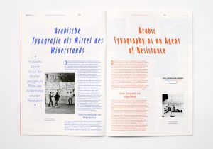
Eps51 Studio, Right-to-Left
It is up to the designer to decide whether to emphasize the contrast between two different scripts and focus on the difference or try to make them work together and match them visually. But to archive an effective combination, both strategies should be always based on intend of use of the project itself. Generally, a dictionary and an art exhibition poster won’t have the same needs when it comes to hierarchy.
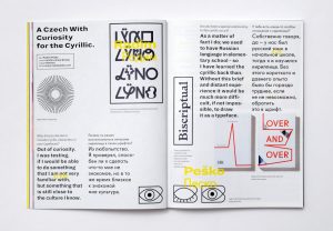
Eps51 Studio, Bi-Scriptual
This choice could be a result of a semantic approach, in which the level of contrast between the two languages is used to reinforce the message of the text and its meaning. In the same way the choice of a certain typeface can tell a different story based on its history or visual appearance, the contrast between languages, or the lack of it, can highlight a need of differentiation or homogeneity.

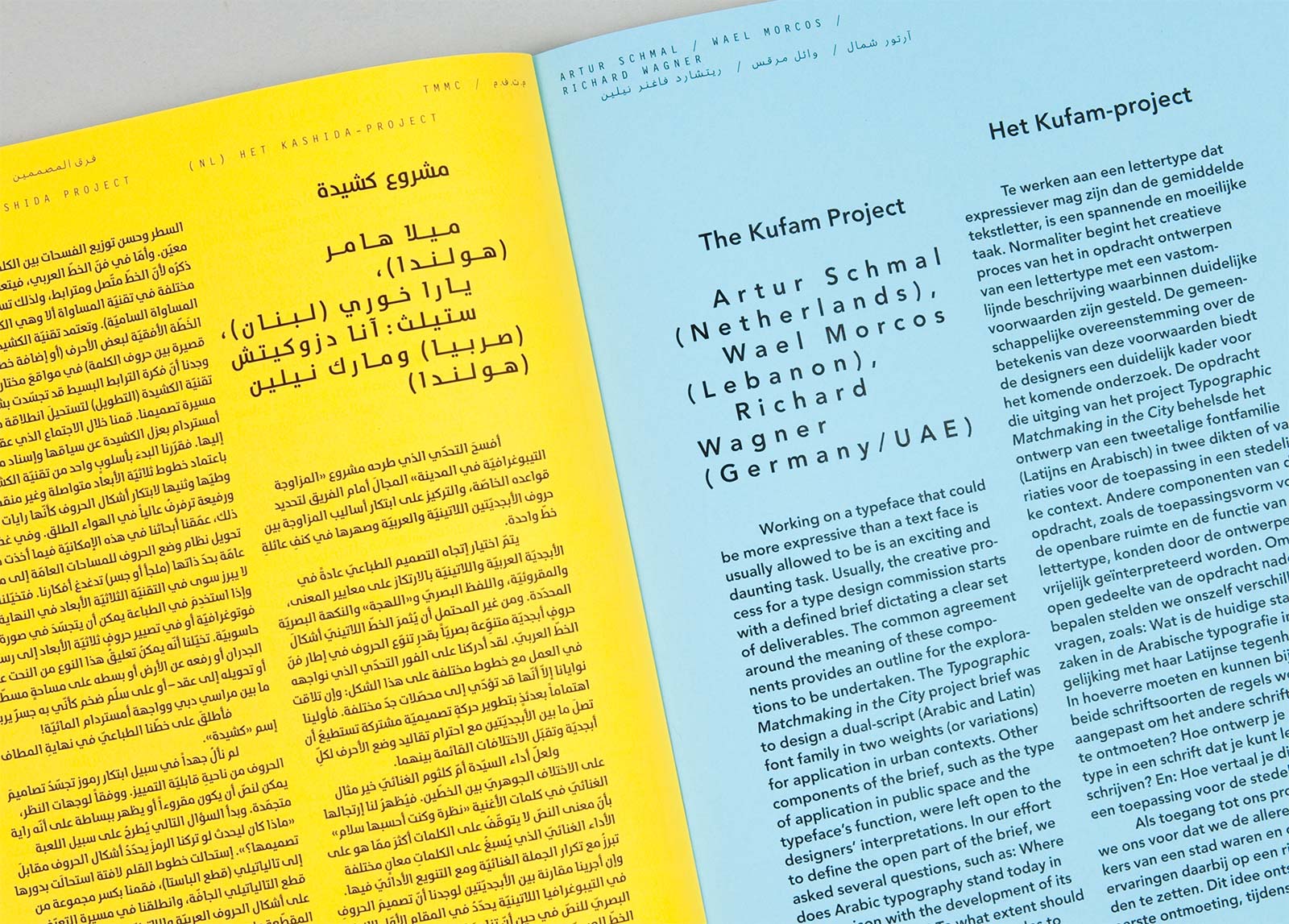
Carvalho Bernau,Typographic Matchmaking in the city
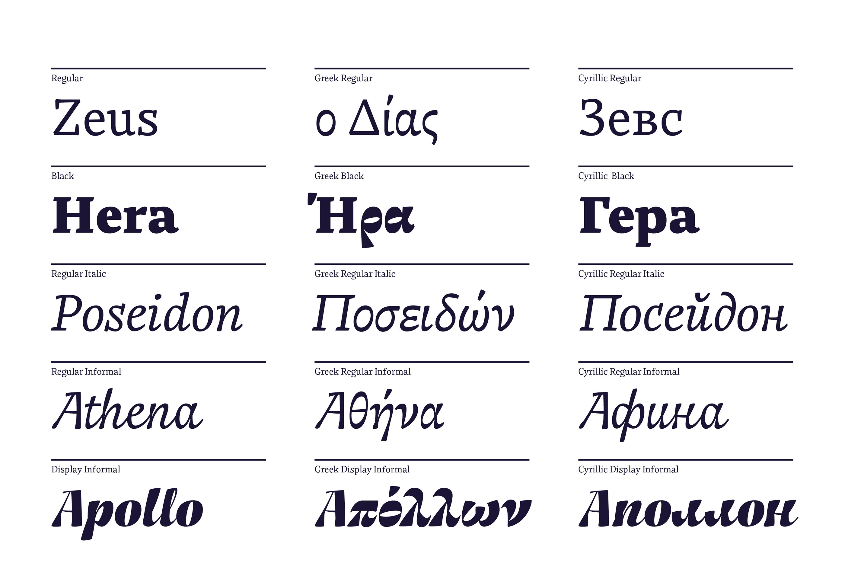
When a text includes words written in a different script, for example in Greek quotations, which require the use of special characters, the designer must also choose between homogeneity or contrast. One possibility is to use a typeface which holds all the characters needed for both scripts and provides a homogeneous texture. In this case, a multi-script font family would be a perfect match ensuring style consistency. But when a certain level of contrast is suitable for the text needs, the designer can also combine two different typefaces with contrast enough to highlight the foreign words. This would be a good solution if the main typeface does not include the special characters in its library.
Still it is important to avoid the combination of two typefaces in the same word, to fill the lack of special characters in the main font. It main sound odd at first, but it is a common choice when the desired font does not include diacritical marks or the complete Greek alphabet for example. The result is always a bizarre collage of letters which possibly do not share the same structure, proportions or style. It is the equivalent of forcing the use of small caps in a font that does not include them or the manual slant of a font to get the missing italics. It is a simple no-go for language combination, specially when thinking about the vast collection of multi-language and multi-script typefaces available today.
In short, fine script combination comes from visual sensibility. Both contrast or homogeneity strategies should pursue a harmonic page, in which the scripts used are balanced but maintain their own personalities and values.

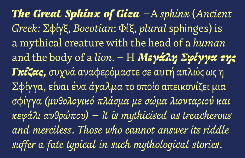
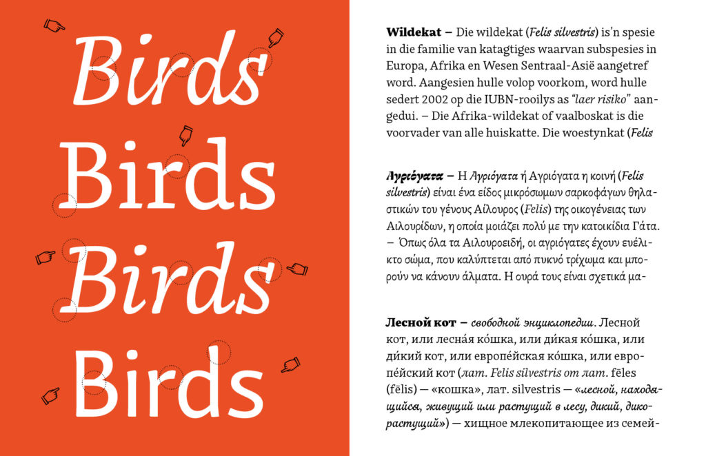
Franziska Hubmann, Bynx Font Specimen
[1] What is Multi-script typography all about? Interview by Rosetta type foundry https://www.rosettatype.com/blog/2013/02/05/What-is-multiscript-typography
[2] Bringhurst, Robert. The Elements of Typographic Style (page 93).
Images
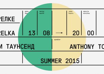
1 Anna Kulachek, Strelka Institute http://kulachek.com/HSU-at-Strelka-Institute
2 Eps51 Studio, Right-to-Left Exhibition https://www.eps51.com/projects/right-to-left-exhibition/
3 Eps51 Studio, Bi-Scriptual https://www.eps51.com/projects/bi-scriptual/
4 Carvalho Bernau,Typographic Matchmaking in the city http://carvalho-bernau.com/typographic-matchmaking/
5 Franziska Hubmann, Bynx Font Specimen. https://www.behance.net/gallery/61480511/Typeface-Bynx