Ein alt eingesessenes Medium in eine neue digitale Version zu adaptieren bring einige Challenges mit sich. Das Weltformat poster festival in Luzern beschäftigte sich bereits das dritte Mal mit Bewegt-Postern in der Ausstellung „DAS BEWEGTE PLAKAT#3″(Vorangehend „DAS BEWEGTE PLAKAT#1“ & „DAS BEWEGTE PLAKAT#2“).
Laut Kurator Josh Schaub kommt die Faszination für Bewegung in Plakaten vom Aufkommen von Screens überall und in jeder Größe.
Das Medium wird also im heutigen Zeitalter regelrecht dazu gezwungen, sich anzupassen. 2016 gab es bei der Ausstellung „DAS BEWEGTE PLAKAT#1″ noch ganz genaue und strikte Regeln dazu. Ein Design musste die formalen Elemente eines Plakats beibehalten, mit traditioneller Rhetorik kommunizieren, an das Hochformat angepasst skalierbar sein und die Animationen so verwenden, als ob es eine „fünfte Farbe“ oder eine spezielle Drucktechnik wäre. Allerdings kristallisierte sich schnell heraus, dass sich zoomende, pulsierende oder wirbelnde Designs sich ebenso gut bewähren, sowie den Zeitgeist und den Geschmack der Betrachter exakt trifft. Somit wurden für spätere Ausstellungen die Kriterien aufgelockert.
Bei dieser neuen Art von Animation stellt sich jedoch immer die Frage, wie die Kommunikation dabei funktioniert. Wie wird es gemacht, dass die Bewegung die Aussage unterstützt und nich davon ablenkt? Wie wird die Animation am effektivsten eingesetzt? Und wo liegt die Grenze um ein Design bedeutungsvoll zu halten anstelle einfach sich bewegende Elemente als Aufmerksamkeitserreger zu missbrauchen?
Josh Schaub, der Kurator der Ausstellung, gab anhand fünf verschiedener Poster der Ausstellung Statements und Analysen ab:
1
Tennis
“I found the answer to one of my key questions—what form of movement is best for a moving poster?—in Tim Lindacher’s minimally-charged design. It’s very simple, with one single continuous movement taking place as the tennis ball spins. All compositional devices, from the white space to the typography, are untouched, which means the image retains the strength of a placard. Rather than functioning like a film, where change happens, the elements in place keep their bold, graphic form. The choice of movement feels very natural and doesn’t distract from the content. Instead, it arouses interest.”

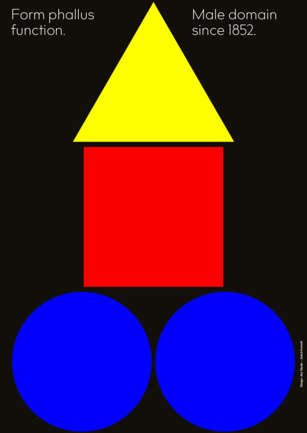
2
Form Phallus Function
“You’ll find moving posters in railway stations and in crowded social media feeds, where they battle for two seconds of your attention. That’s why a moving poster should not contain any—or only an extremely fast—storyline. The plot needs to be recognizable in a short time, taking us from A-B quickly and smartly. That’s what Jakob Maurer, Christopher Hegenberg, and Jakob Kornelli’s ‘Form Phallus Function’ poster does, with its simple and fast jumps. A successful poster should be understood in a very short time, animated or not.”
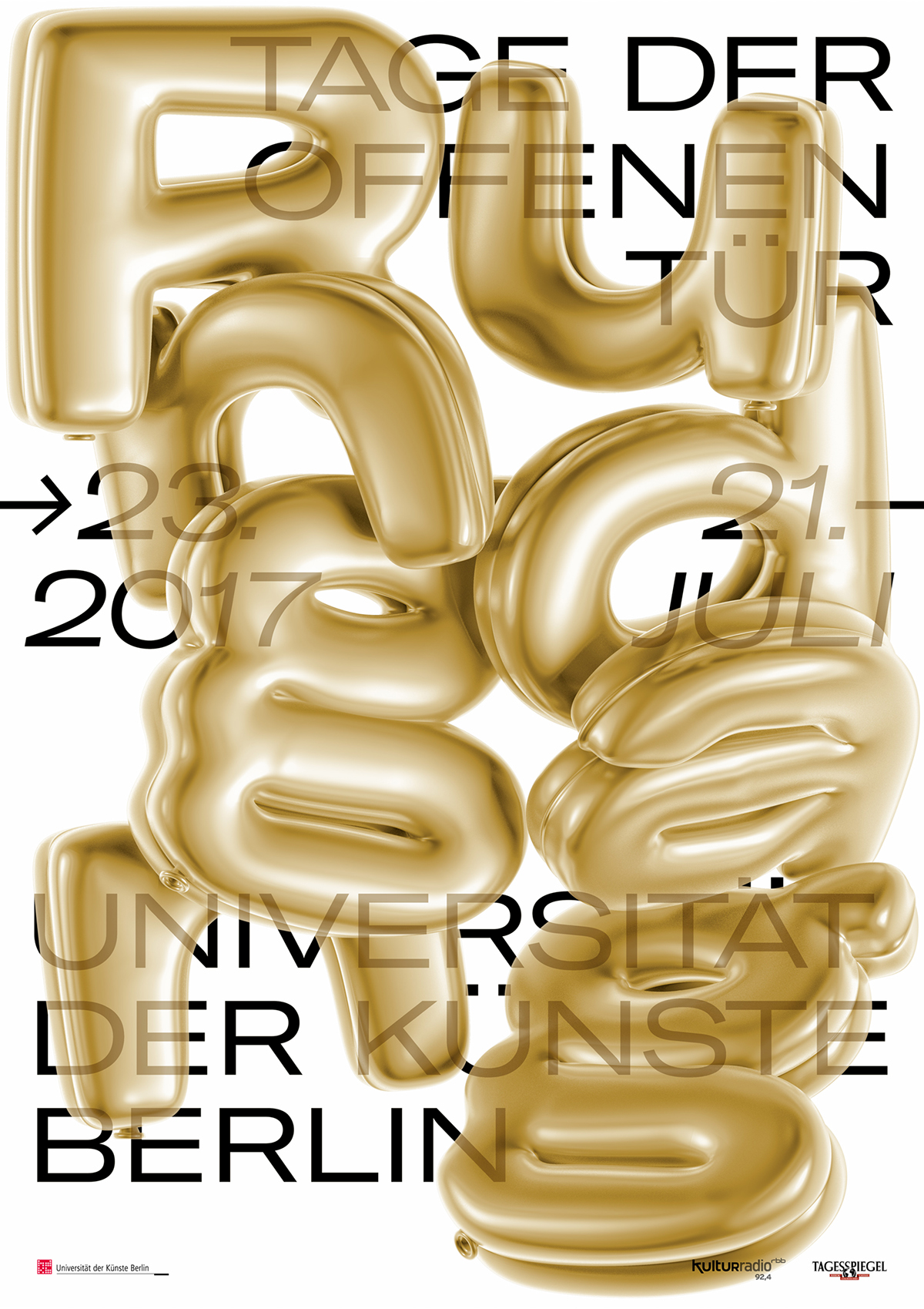
3
Rundgang
“The most frequent kind of animation you’ll find on moving posters is animated objects. It’s not a coincidence, because objects usually have a movement that we associate with them (for example, a balloon rises). Moving typography, in my opinion, is a more complicated kind of animation, and that’s why we’re starting to see a lot of moving posters that combine objects with type.
“This is the case with Berlin-based Denis Yılmaz’s poster for the ‘Rundgang’ (meaning tour) at the University of the Arts in Berlin, in which type-shaped balloons fly through the picture. A second layer of type is also placed statically under the flying objects. While in the print version it’s important to ensure that the balloons don’t obscure the second layer of writing, in moving form you can conceal and reveal, creating an exciting interplay.”
4
Vlow
“Text on a poster is rarely moved around. And if it is, it’s usually pushed, or distorted. Typography that is shifted back and forward is a good technique for those experimenting with moving posters, because it doesn’t distort the poster’s statement. However, type being pushed back and forward can get quite boring, quite quickly: it’s something we see a lot.
“An exciting solution of the pushing around technique is this one by Switzerland’s Studio Feixen. Not only is the type pushed around but so is everything else on the poster. There are two distinct levels here—the typography and then graphic forms, and they’re linked by the rhythmic movement that ‘shifts’ them around.”

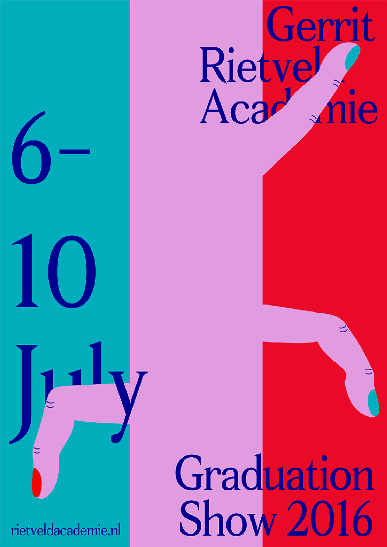
5
Graduation Show
“I began these selections with a simple poster (the turning tennis ball) and now I’m going to end with a poster that shows numerous elements at play and various animation techniques. As with the first poster, typography and background remains firmly in place. Unlike it, small objects like fingers, tongues, and a beak peek into the picture. Without a clear beginning or end, it generates an atmospheric mood.
“That’s what I ultimately think a moving poster should create. A mood. The basic idea is that a poster should not change or be too wrapped up in narrative. Instead, it should emphasize the actual message. This poster by Medeina Musteikyte, Daphne Spelier, and Marie Louise Gjerlev articulates my point perfectly: it transports you to a poetic place, all the while remaining a moving graphic and not becoming a film. Although it moves, it’s the rest—the complete picture—that generates the force.”