1.photography

Latitude Music Festival
These designs draw on the spectacular views of the lakes and forests of Henham Park, where the festival takes place. „We used decorative fonts for the logo, but we wanted to keep the graphics tight. The logo uses a diamond-shaped wire frame with four corners pointing to the southeast and northwest, so I hope did the latitude latitude line concept can be Realized.“
Form went to the festival one week before the opening ceremony. Photographer Peter Beavis filmed the whole process of the event. For us, the festival is about the emotional experience of the event.

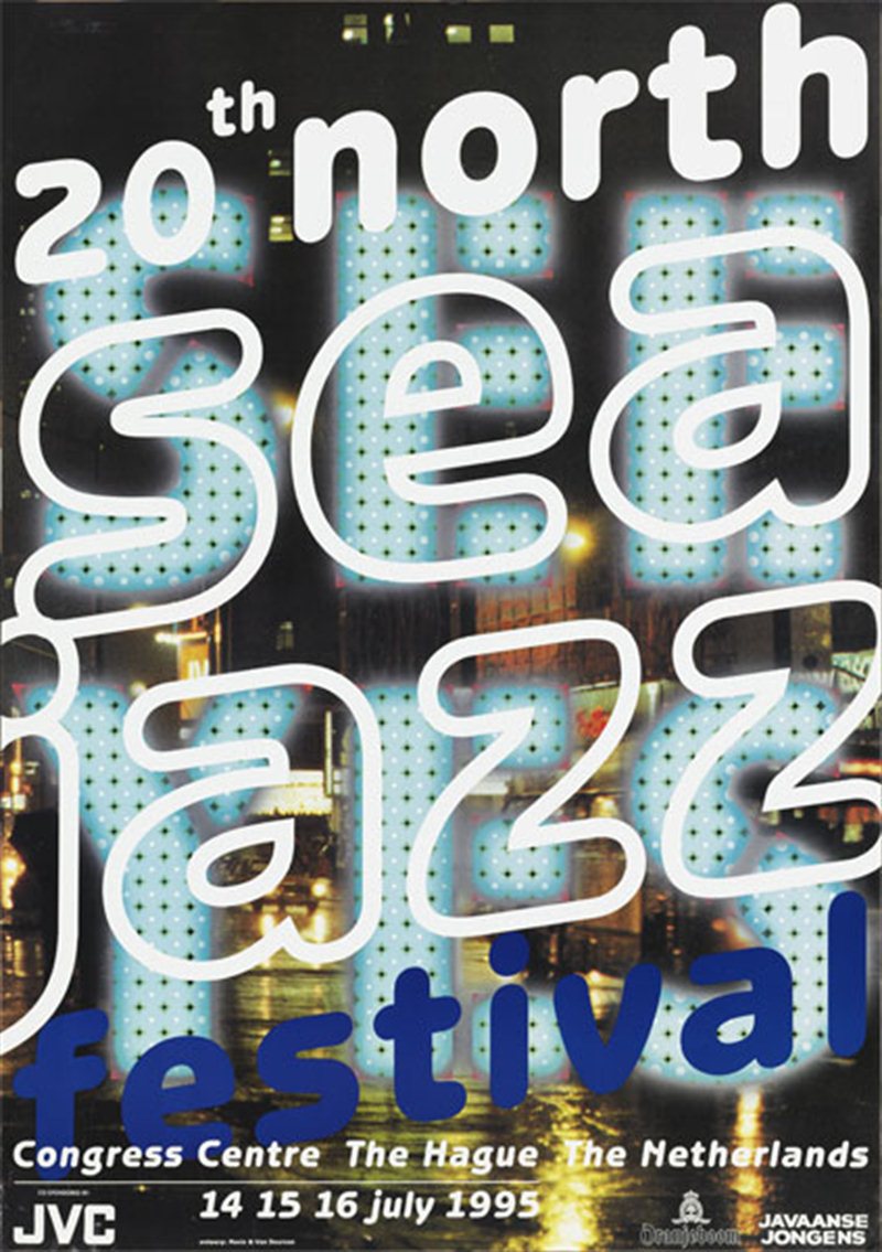
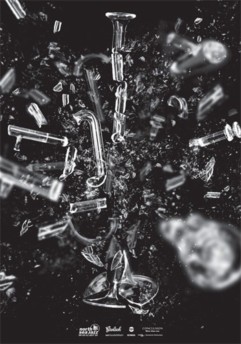
 By now the artposter has become an annual recurring element of the festival. The first artposter dates back to 1981 and was designed by Rafal Olbinski.
North Sea Jazz Art Poster

2.Fonts + vector
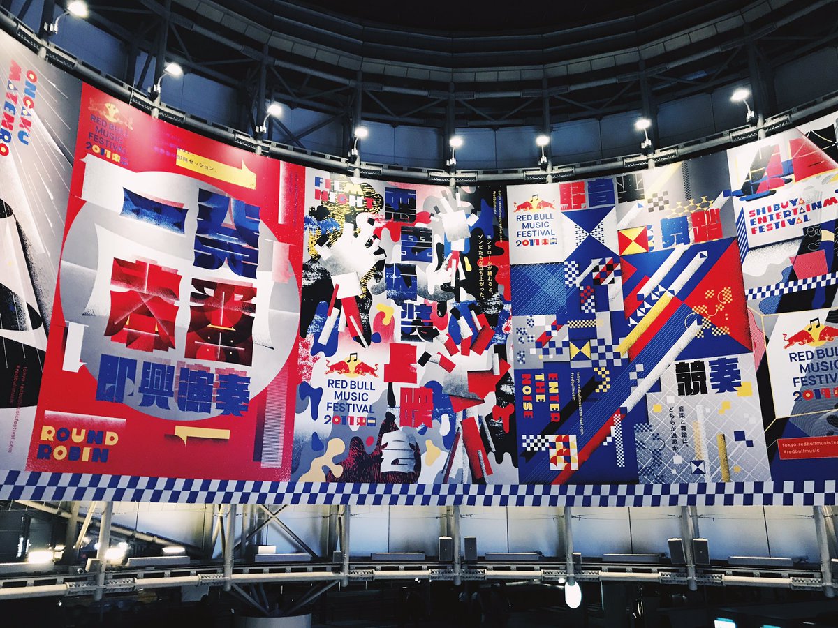
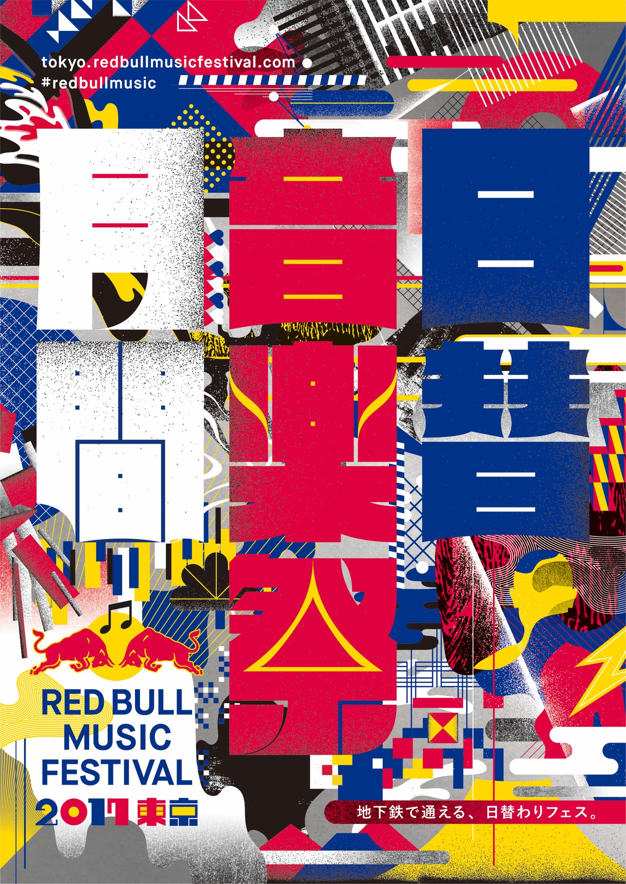
2017 red bull music festival
J-POP, hip-hop music, noise, video game music, etc., and more to gather some key pioneers from the Japanese music industry.
Creative director Morihiro Harano and the visual director of visual design studio TyoMe designed a series of visual effects that excite people. They use bold colors (from the sponsor’s palette), combined with a radical geometry typography, spelling words like „month“, „daily“ and „music festival“.
 The Tokyo Red Bull Music Festival, held in October 2017, is the perfect meeting point for music and graphic design. You can see some posters near Tokyo, bold use of color and typography, they are simply amazing.