Testing features of heat maps in Hotjar

After gathering information and researching topic, the next step was to get to the actual using of software. For now my main interest was creating the first heatmap. Since there’s no such feature in Google Analytics I chose another tool. I set up tracking by adding simple lines of code to my personal website.

  1. Hotjar provides users with a number of information about users such as country of origin, OS, time on website, resolution of the display etc.

2. The most interesting feature is heat maps. It’s possible to select scroll or tap maps, data from desktop computers, phones to tablets.  Map gives clear visualisation that most of users sorted out types of the work.


3. It’s possible to view a session of the single user as well

Fitts’s Law in Design

Fitts’ Law demonstrates how to ease interactions through the careful sizing and positioning of interface elements. It states: The time it takes to acquire a target is a function of the distance to and size of the target. It is particularly important when designing buttons and other clickable on-screen elements.

1. Size
When an entire button is large, clickable, and has clear boundaries, they’re easy to select. Users can intuitively understand where to click and where not to click. But forcing users to point their cursor directly over a specific part of a button, like the text, requires more precision and time. But bigger isn’t always better. Buttons that are large enough to demand attention without disrupting the visual balance of your page are what maximize usability.

2. Distance
When users land on the website, and you want them to take a specific action, you need to estimate where the starting point of their cursor will be. This is called the prime pixel. It allows building a consistent and easy-to-navigate site and creates the shortest path to the desired CTA. For instance, Google’s search box is always in the center of the screen because when users enter the site, they’re most likely looking at the middle of the screen. Most of the time, the prime pixel should influence the location of the target object. And the shorter the path to the desired action, the better the user experience.

3.Effort
A lot of vital commands like ‚exit‘, ’start‘, and ’shut down‘ are located in the corners of your computer screen. Placing buttons there makes it easier for users to select them because the buttons are pinned by two sides. And the cursor stops at each side, so you can’t go beyond them. This means you don’t have to be as precise when you want to click a button in a corner or edge. You just have to move your cursor to its general vicinity.

It’s always important to test assumptions. I found an online software where it’s easy to check it. http://fww.few.vu.nl/hci/interactive/fitts/

  1. Al circles are of the same size and in equal distance to target.
  2. Circles are still the same but the most distant takes the longest to target.
  3. Circles are different sizes but in equal distance. It proves that biggest objects are easier to aim.

  1. Fitt’s law. https://blog.hubspot.com/marketing/fitts-law
  2. Test programe http://fww.few.vu.nl/hci/interactive/fitts/
  3. The importance of size and distance in UI design https://www.interaction-design.org/literature/article/fitts-s-law-the-importance-of-size-and-distance-in-ui-design

Key Metrics in Google Analytics

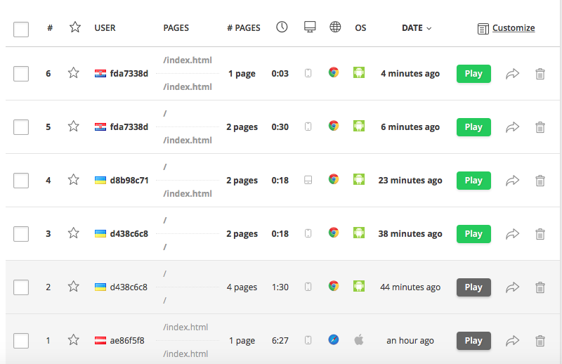
Google Analytics is a complicated tool with a lot of options. But what are the most useful reports and metrics that a designer should pay attention to? If an objective to redesign a website then critical indicators of poor performance include bounce rate, conversion rate, exit rate, a lower engagement that signify visitors have problems interacting with the content of the website.

Bounce rate is a metric that measures the percentage of people who land on the website and do completely nothing on the page they entered. So they don’t click on a menu item, a ‘read more’ link or any other internal links on the page. This means that the Google Analytics server doesn’t receive a trigger from the visitor.

Conversion rate is the indicator of the proportion of visitors who end up making a purchase or completing another action that is beneficial to the owner of the website. It brings in revenue and often a website’s primary indicator of success.

How fast a website load is critical for most visitors. If load speeds are too slow, visitors may quit waiting and leave. Improving load speed is one of the best ways to improve engagement.

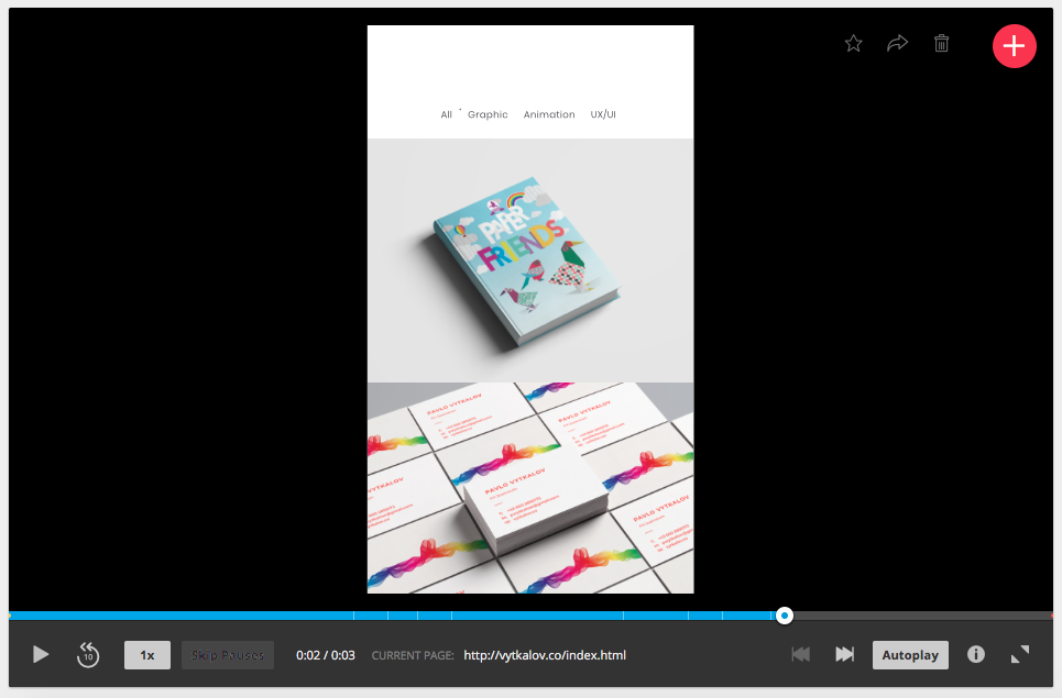
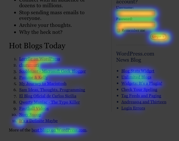
Engagement indicators show how much visitors interact with the website. These include the duration of time they spend and the number of actions they complete (downloading files, watching videos, filling out forms, etc).

1. How to Use Google Analytics to Improve Your Web Design Projects https://www.shopify.com/partners/blog/google-analytics-to-improve-web-design-projects

2. Understanding bounce rate in Google Analytics
https://yoast.com/understanding-bounce-rate-google-analytics/

3. Critical Metrics to Watch With Google Analytics https://www.a2hosting.com/blog/8-critical-metrics-watch-google-analytics/

Google Analytics 101

Google analytics is a tool that helps to track the behavior of the user. It helps to understand how users interact with the website, which buttons and how often he clicks. How user moves through a website and what he likes what ignores. The goal behind Analytics to better understand the user, his preferences, pattern of behavior and overall create the better user experience.

One of the most effective features is heat maps. It visualizes user behavior and how he navigates through the website. That’s crucial to understand if a design fulfills the goal. For example, the designer places some information on the right side of the website. But a heat map shows users ignore the section, therefore, the design doesn’t convey the message. It could happen another way. Users do some intense mouse clicking on the empty area expecting a button/menu which is not there. Google Analytics also shows how users jump from one menu to another one. For example if designers developed a specific user story but users don’t follow it for some reason. It’s important to trust intuition and your skills but I believe it should be backed up with some quantitative research. Google Analytics could be that tool.