THE MOVING POSTER

1.Questions needed answers

1.whether moving posters are needed at all, which approaches work best and what the future of the medium could look like.

2.Who benefits from the new possibilities and seemingly boundless gimmicks – the designer, the client or the user?

3.Is the moving poster only a short-term trend or the obvious further development of the static poster?

4.Has the potential been fully exploited – what about interactive moving posters?

5.What distinct features are lost when translating static posters into moving ones

6.how far can designers go without diluting the strength of the poster and its impact?

7.And at what point is a poster no longer a poster?


2. The moving poster

In 2016, the exhibition  The moving poster # 1  explored the many possibilities offered by this new medium. In 2017, static posters  Moving Poster # 2 . In 2017, The moving poster # 2, the theme of the second exhibition is very special. The posters uses static posters, and the mobile app, you can see the AR dynamic poster on the spot, and add sound effects to the various possibilities of dynamic posters. For the third edition of the exhibition series, graphic designer Josh Schaub has exchanged ideas with other designers about the future of moving posters and presents the results of the discussions.

The moving poster # 1
The moving poster # 2
The moving poster # 3


3.Motion graphics & Parametric graphic design become trendy 

The choice of brand promotion is no longer a static one

Font design can be parameterized

Design schools have started dynamic graphic courses

Put programming into the design is your tool

Samsung poster

4. Relevent persons and events

TYPOMANIA      World Graphic Format Festival    Josh Schaub   

Dia Studio     Zach Lieberman    Stink Studios    The Mill


reference:

http://www.zuibishe.com/article/322, 

https://weltformat-festival.ch/en/2018/exhibitions/the-moving-poster-3


stage 2: Moving poster research

After music festival I’m applying to my music festival poster design. which is animated poster, why it is getting popular, how it works, who is the master of this field, which carrier does it use to perform. Those are the questions I am going to do research.


1.Spectrum

1.1 definition

The moving poster is placed between the static poster and the moving film. Although it is a cross between both disciplines, it is still a poster, and as such  , there are still many names of moving posters: animated poster, gif poster, interactive poster, motion poster, dynamic poster, I think the name of this poster should be fixed, otherwise it will cause some unnecessary troubles.

poster, moving poster, movie

1.2 three genres of moving posters

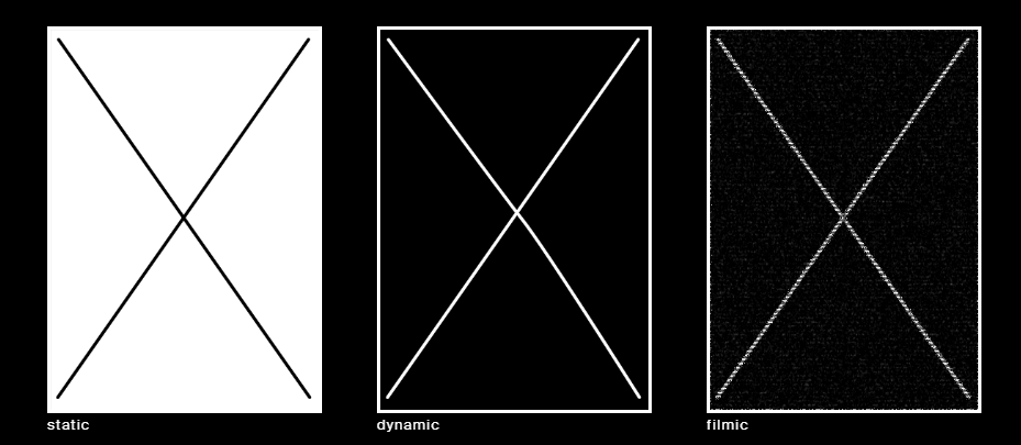
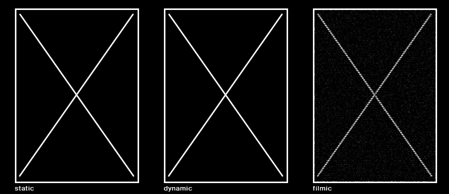
The moving poster offers a wide range of static, dynamic and even filmic examples.

-static

The posters in the group have been minimally animated . There are no position changes in the poster, therefore the effect is predominantly static and still very similar to the printed poster. Posters show alternating  color surfaces, alternating examples or alternating single visuals. 


-dynamic

The posters in this segment can be broken down into innumerable formats and content categories, which sometimes overlap. Posters demonstrate a single, central movement or many smaller divided movement processes. Certain posters show abstract animation content, such as pushing items or turning. Others show realistic movement such as the revolving light of a lighthouse or buses driving past. Some posters are played continually without a plot and therefore without a start and finish. Others have a dramatised build up with a clear structure.


-filmic

The posters in this group are very close to film. The movement is almost exclusively on certain filmed scenes. On the one hand, poster show movie scenes which interrelate with typography. Others show only film scenes and typography without any significant point of contact.  


References:  http://www.themovingposter.com/

music festival brand collection 2

1.photography


Latitude Music Festival

These designs draw on the spectacular views of the lakes and forests of Henham Park, where the festival takes place. „We used decorative fonts for the logo, but we wanted to keep the graphics tight. The logo uses a diamond-shaped wire frame with four corners pointing to the southeast and northwest, so I hope did the latitude latitude line concept can be Realized.“

Form went to the festival one week before the opening ceremony. Photographer Peter Beavis filmed the whole process of the event. For us, the festival is about the emotional experience of the event.

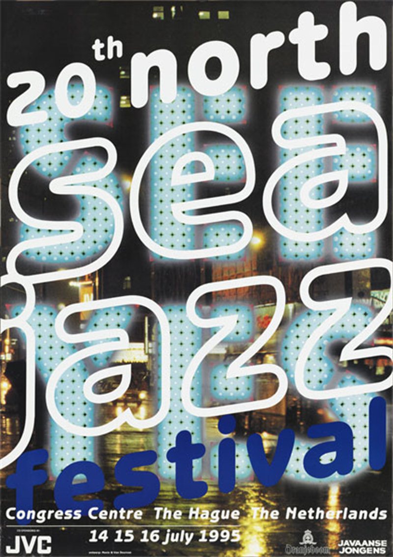
By now the artposter has become an annual recurring element of the festival. The first artposter dates back to 1981 and was designed by Rafal Olbinski.

North Sea Jazz Art Poster 


2.Fonts + vector

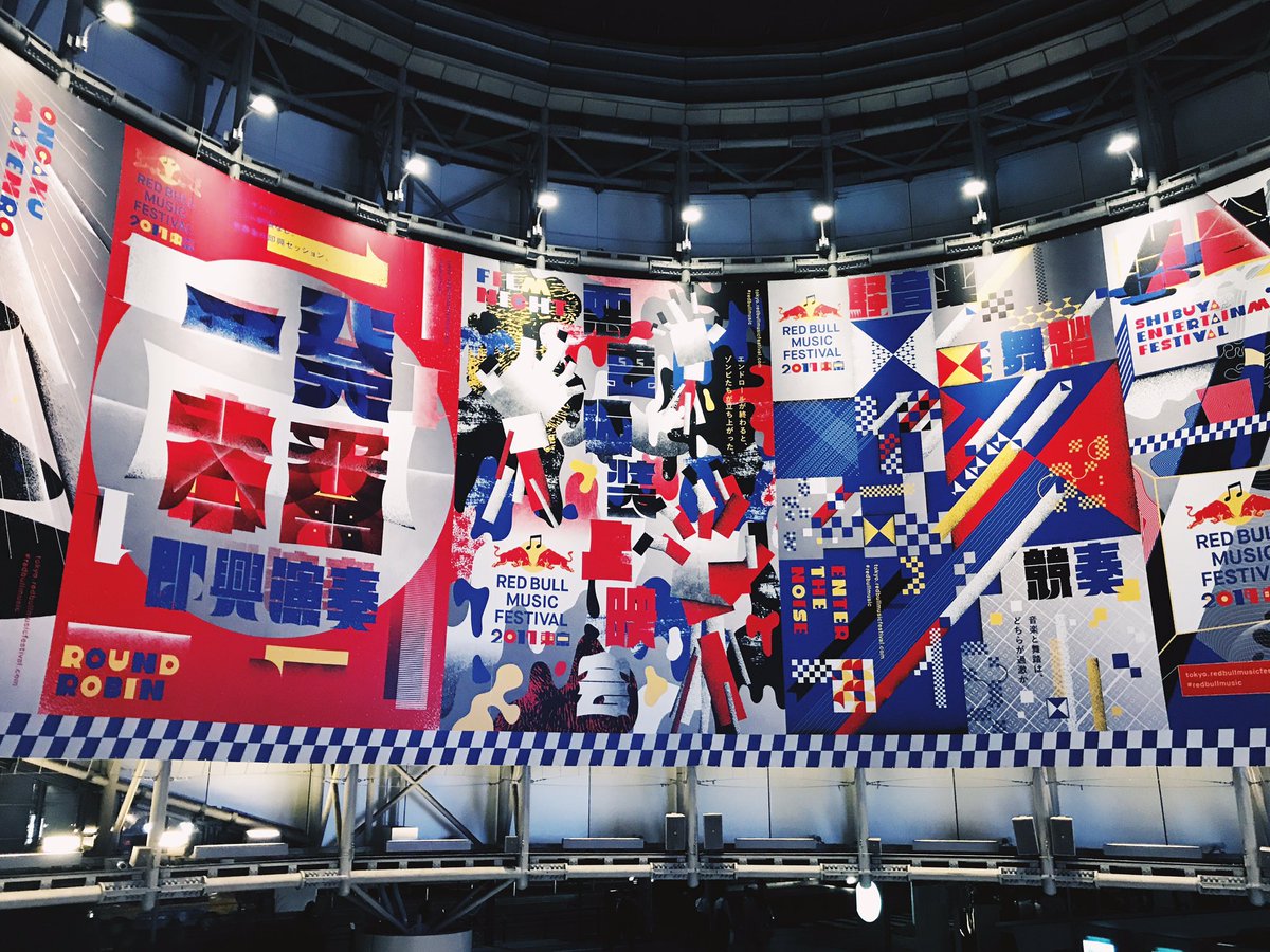
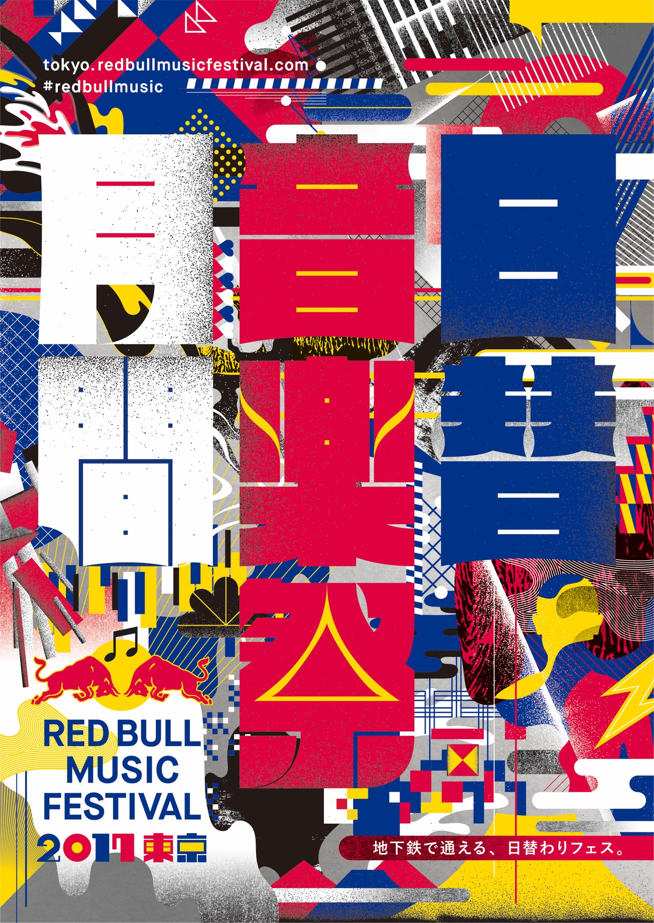
2017 red bull music festival
J-POP, hip-hop music, noise, video game music, etc., and more to gather some key pioneers from the Japanese music industry.
Creative director Morihiro Harano and the visual director of visual design studio TyoMe designed a series of visual effects that excite people. They use bold colors (from the sponsor’s palette), combined with a radical geometry typography, spelling words like „month“, „daily“ and „music festival“.

The Tokyo Red Bull Music Festival, held in October 2017, is the perfect meeting point for music and graphic design. You can see some posters near Tokyo, bold use of color and typography, they are simply amazing.

Music festival Brands Collecting

The most beautiful thing in the world is the sight of the sky and the rhythm of the ear. Music always evokes the most enthusiastic echoes in people’s hearts, and the existence of music festivals is different from concerts-they are also expressions of art. The festival seems to be more likely to lead people to the „self“ that should be released-the unrestrained, unyielding, bold, free and easy soul, and a section of rhythm. It is the spirit that seduces every unruly soul that transcends the body to do whatever it takes-to see the chorus of thousands of people at the festival, and everyone will recognize it-that is the charm of music. The festival’s website assets are as fascinating as the festival itself. The designer uses an artistic effect that is almost beyond the „music itself“, feeling the charm of the festival for every visitor who may be there, and its design is excellent almost all over the design world, just like fullmoonfest’s water powder design. Mmf’s hand-painted elements, unlimited release of the passion for music; SXSW,NOSSO is more „realistic“ unrestrained scene is where the designer pen; pitchfork uses the „big character“ design to convey strong feelings. The official website of every music festival is the work of the artist, and here we can see one after another. “ Design emotions „erupt.“

In this week’s blog, I’m classifying music festival brands into different categories so as to research in a more data method: design with science.

1.illustration

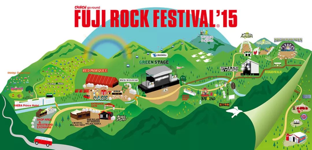
Japan fuji

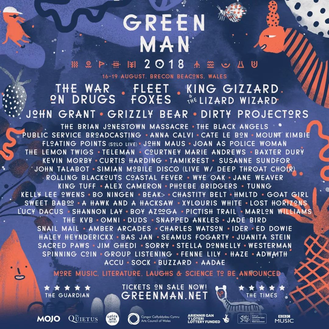
Britan Green Man

Meredith Music Festival 2017

Taipei Azalea Music Festival

2.Vector Graphics

Barcelona
2018 Barcelona Jazz Festival visual image design

3.Font morphing

4.“big character“ design

Pitchfork

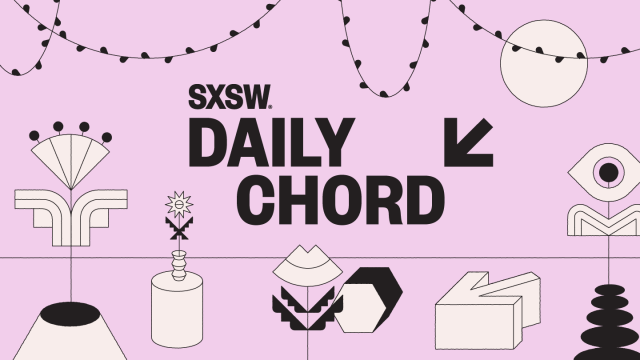
sxsw

references:
http://pitchforkmusicfestival.com/p/1

Music


http://2017.mmf.com.au/

Visual music, see the melody

Music is more than listening
For music, the most intuitive experience of people must be auditory experience, but the original motivation to get close to a certain music must be inseparable from visual attraction.
zero zero

Convert „view“ and „list“ art

From birth to development, visual art and auditory art have been constantly interacting with each other and can be mutually transformed. The basis for the transformation of graphic design and music is the most primitive spiritual experience of people.