The most beautiful thing in the world is the sight of the sky and the rhythm of the ear. Music always evokes the most enthusiastic echoes in people’s hearts, and the existence of music festivals is different from concerts-they are also expressions of art. The festival seems to be more likely to lead people to the „self“ that should be released-the unrestrained, unyielding, bold, free and easy soul, and a section of rhythm. It is the spirit that seduces every unruly soul that transcends the body to do whatever it takes-to see the chorus of thousands of people at the festival, and everyone will recognize it-that is the charm of music. The festival’s website assets are as fascinating as the festival itself. The designer uses an artistic effect that is almost beyond the „music itself“, feeling the charm of the festival for every visitor who may be there, and its design is excellent almost all over the design world, just like fullmoonfest’s water powder design. Mmf’s hand-painted elements, unlimited release of the passion for music; SXSW,NOSSO is more „realistic“ unrestrained scene is where the designer pen; pitchfork uses the „big character“ design to convey strong feelings. The official website of every music festival is the work of the artist, and here we can see one after another. “ Design emotions „erupt.“
In this week’s blog, I’m classifying music festival brands into different categories so as to research in a more data method: design with science.
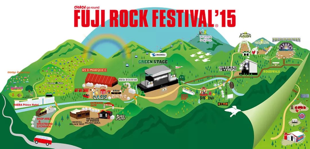
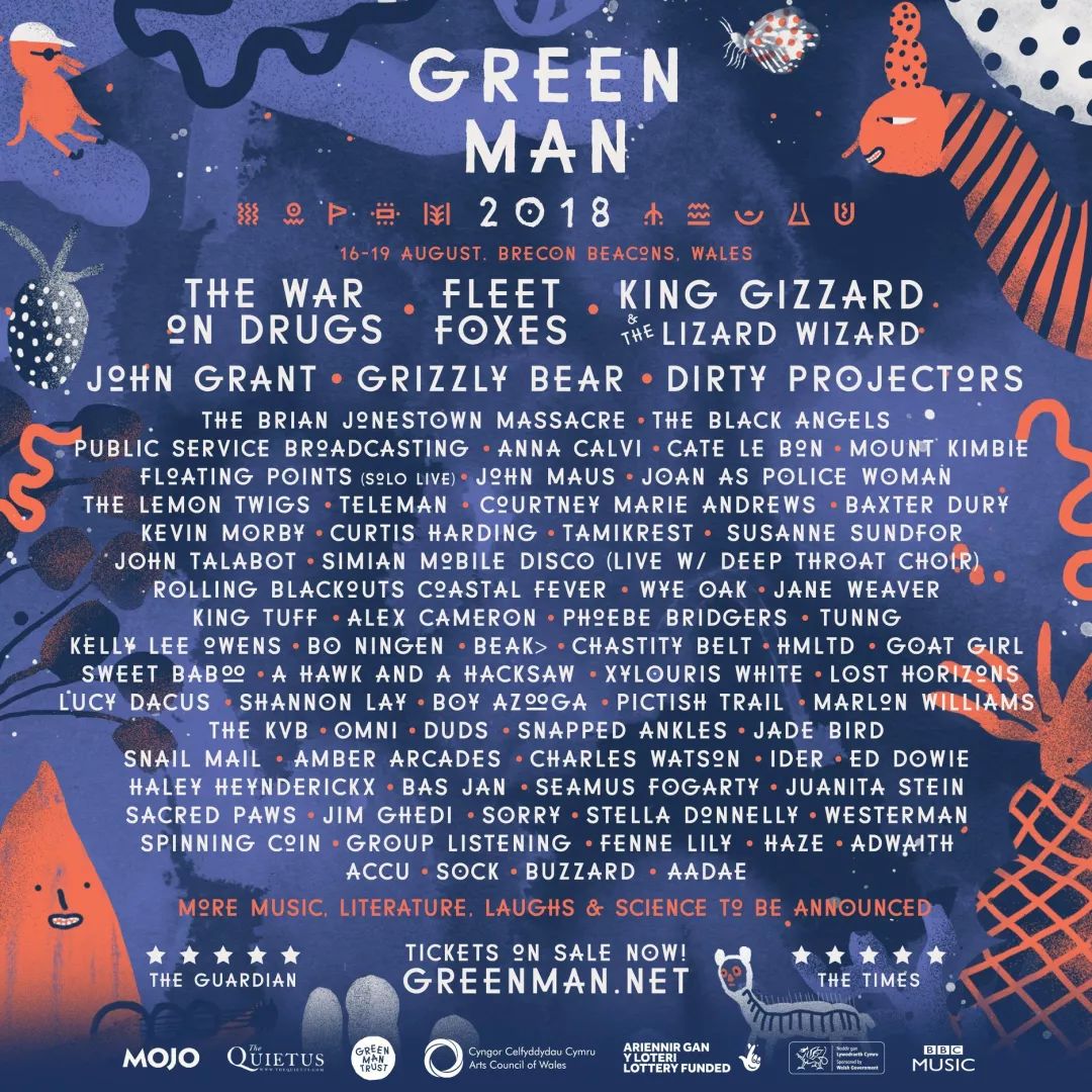
1.illustration

Japan fuji

Britan Green Man

Meredith Music Festival 2017

Taipei Azalea Music Festival
2.Vector Graphics

Barcelona
2018 Barcelona Jazz Festival visual image design
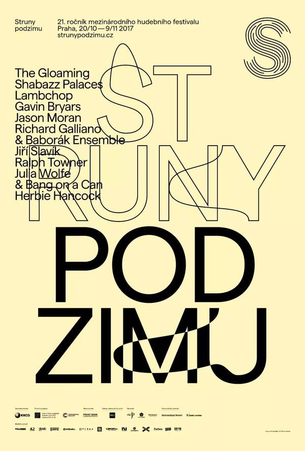
3.Font morphing

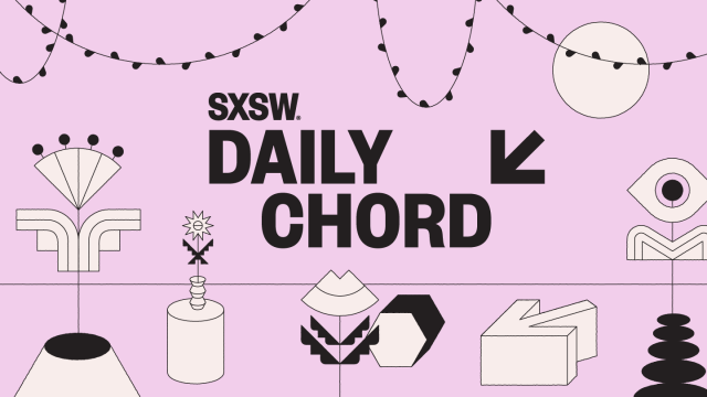
4.“big character“ design

Pitchfork

sxsw
references:
http://pitchforkmusicfestival.com/p/1
http://2017.mmf.com.au/
Nice done lady <3